Preparing Your Data for the Bubble Chart
With our dataset at the ready, it’s time to whip it into shape for our bubble chart. Follow me!
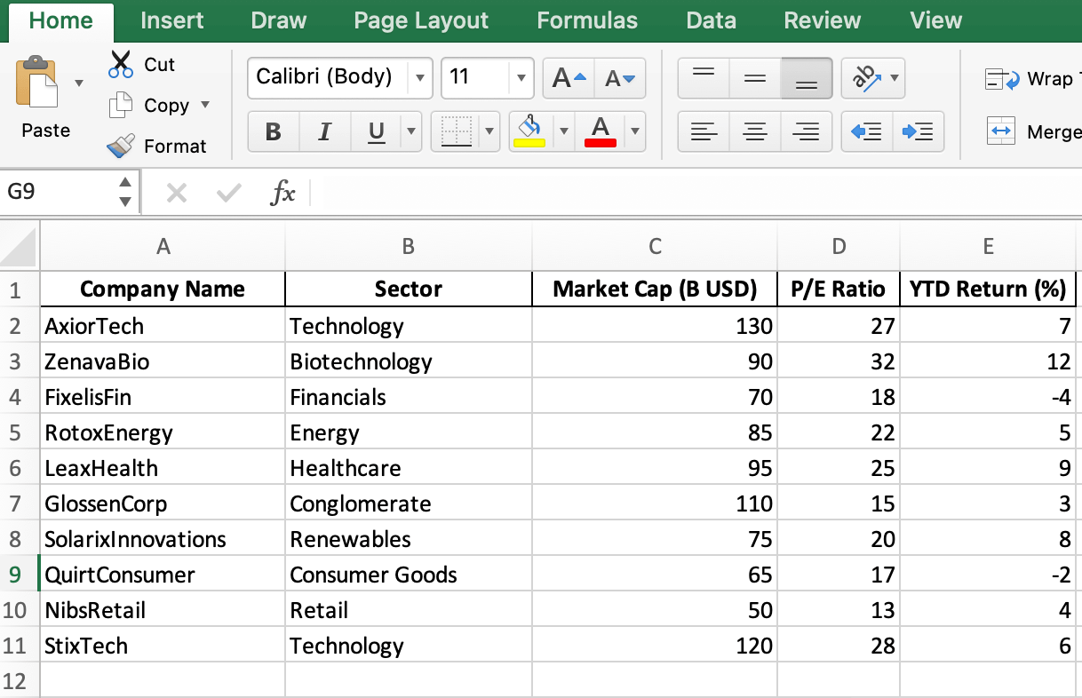
Before creating the bubble chart, make sure your data is organized in Excel. Follow these steps to prepare your dataset:
1. Open a new Excel workbook.
2. Enter the column headers in the first row
- Company Name
- Sector
- Market Cap (B USD)
- P/E Ratio
- YTD Return (%)
3. Fill in the data for each company, ensuring the information is accurate and relevant.
4. Double check your data for any errors or inconsistencies.

Tip: To maintain data integrity, consider using data validation techniques such as drop-down lists for the “Sector” column to avoid typos or inconsistent entries.
Creating a Bubble Chart in Excel
Data’s prepped and ready to go, so let’s jump into the fun part—creating our bubble chart!
Now that your data is ready, let’s get into how to make a bubble chart:
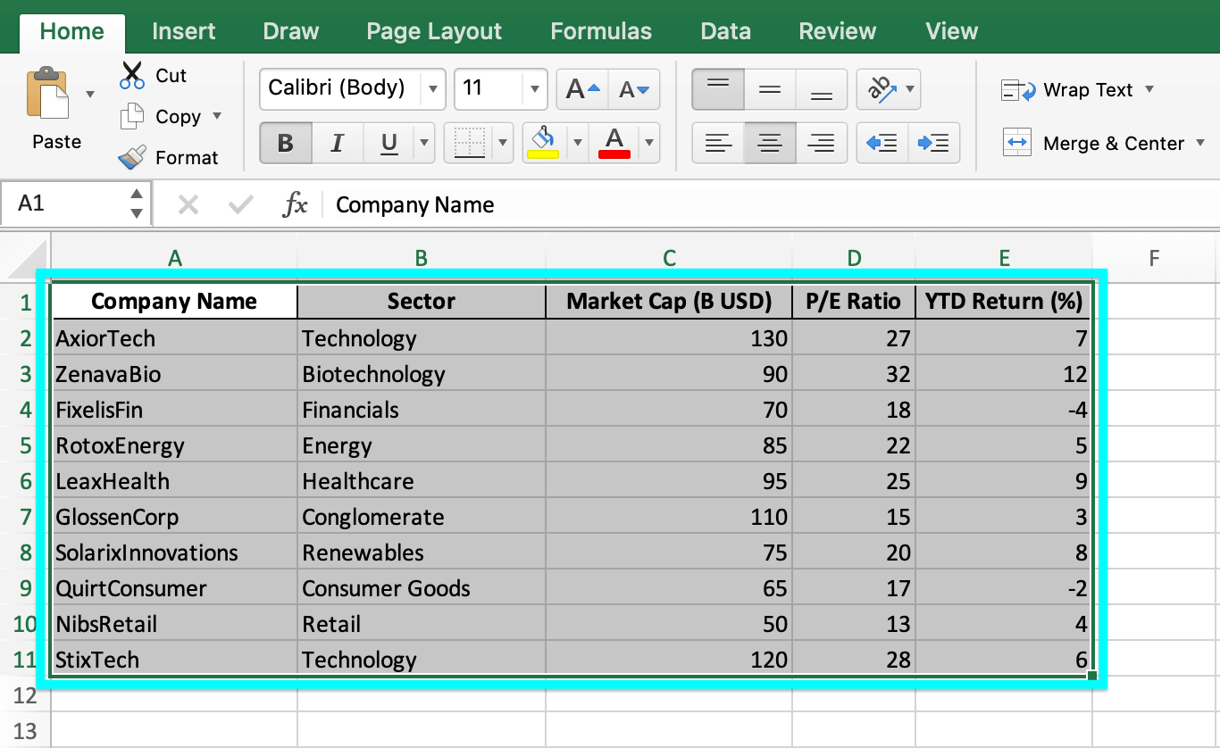
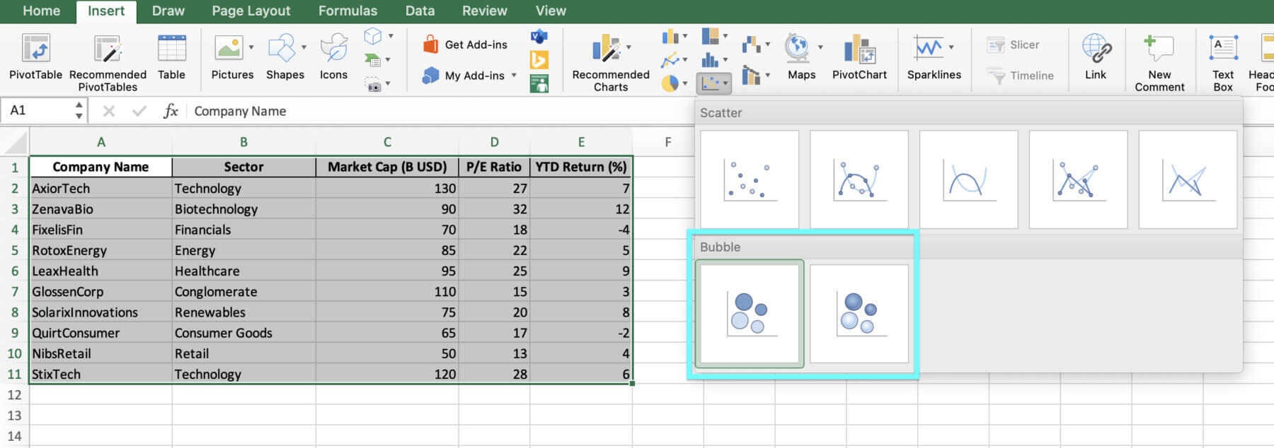
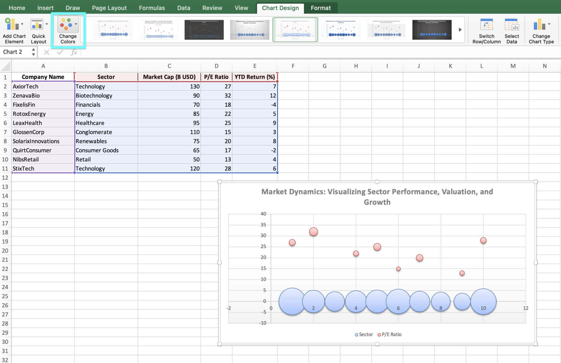
1. Select the data range, including the column headers.

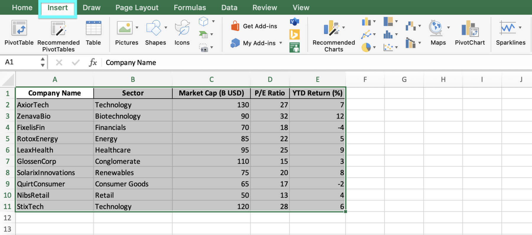
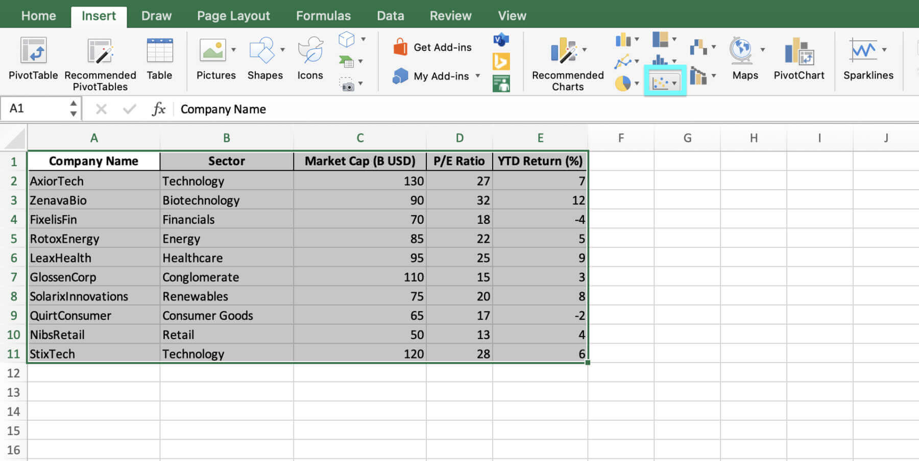
2. Go to the “Insert” tab on the Excel ribbon and click on the “Insert Scatter (X, Y)” button.


3. Choose Bubble from the chart options.

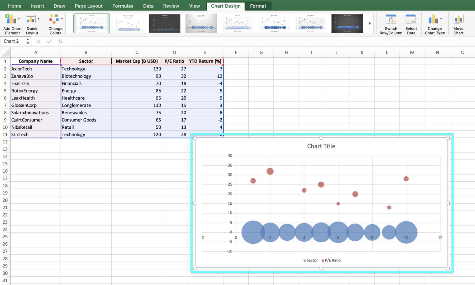
4. Excel will automatically generate a basic bubble chart based on your data.

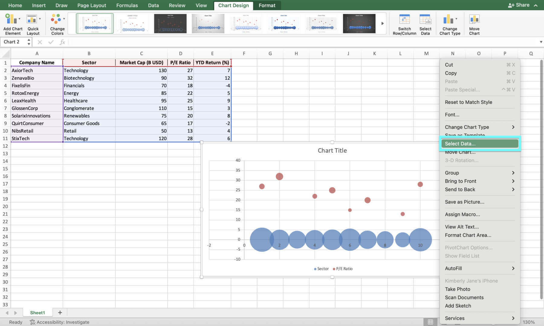
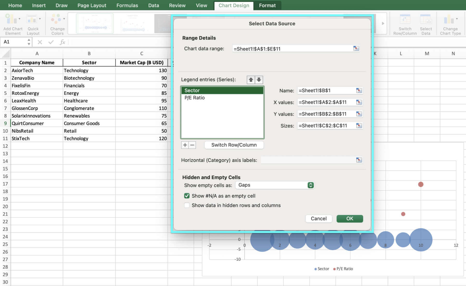
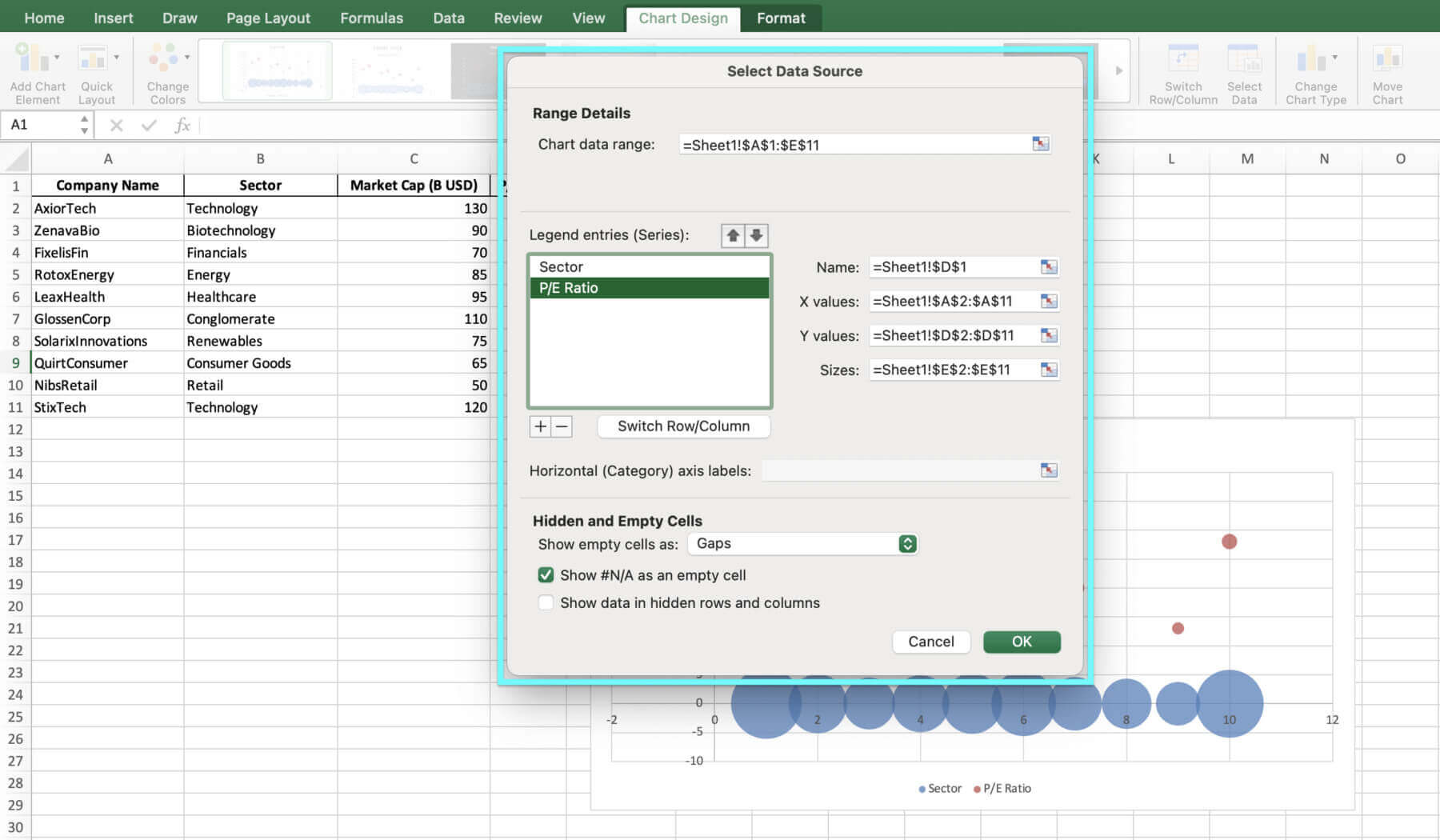
5. To adjust the chart’s data range, right-click the chart and pick “Select Data”. Make sure the correct data range is selected for the X, Y and bubble size values.


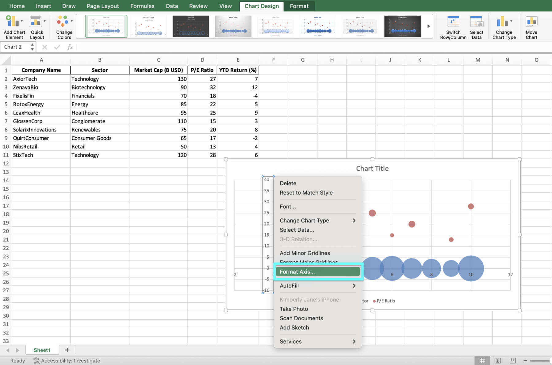
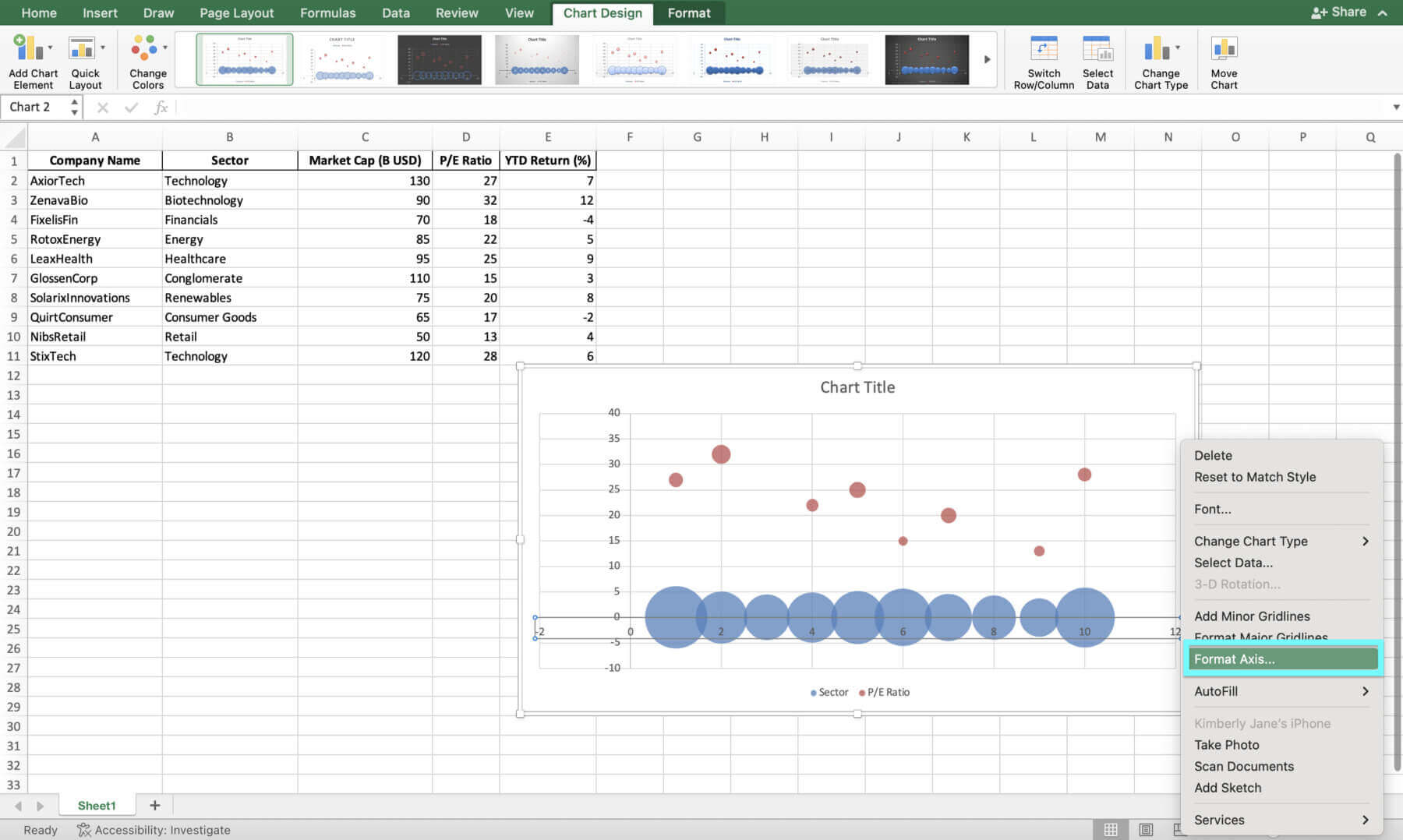
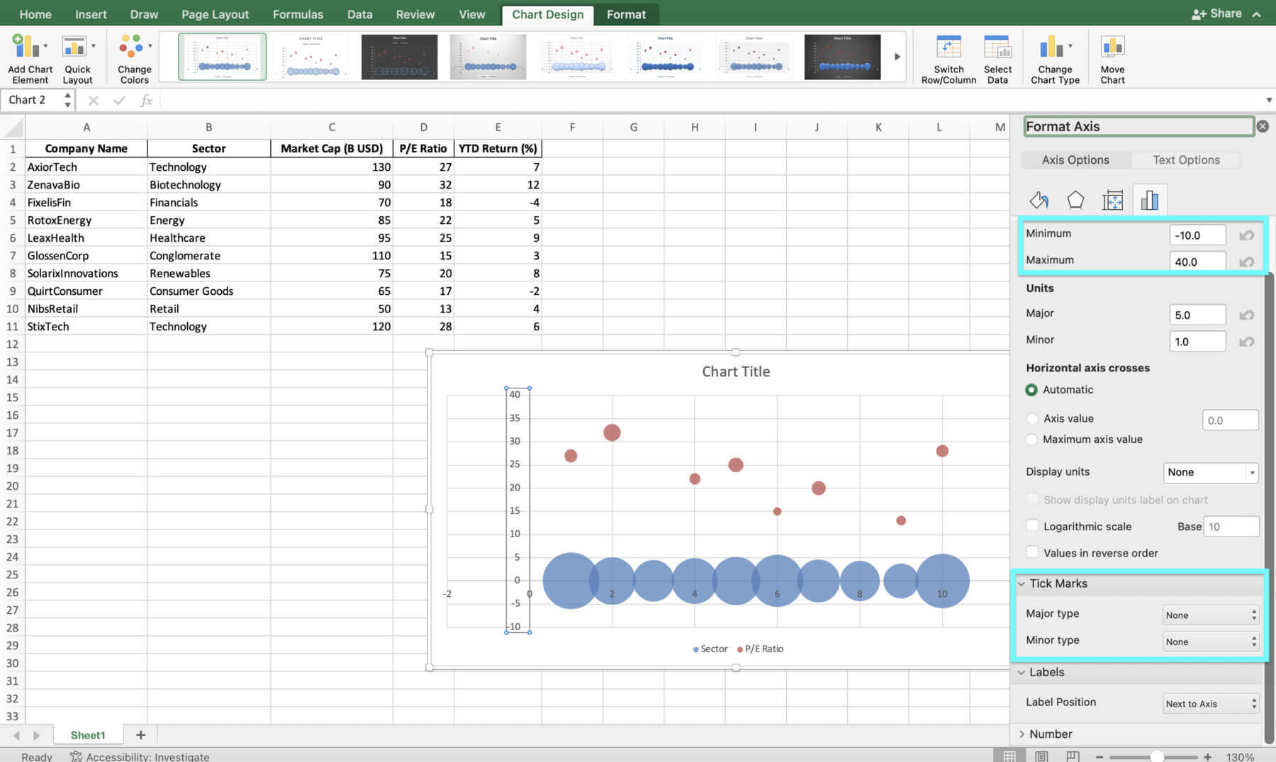
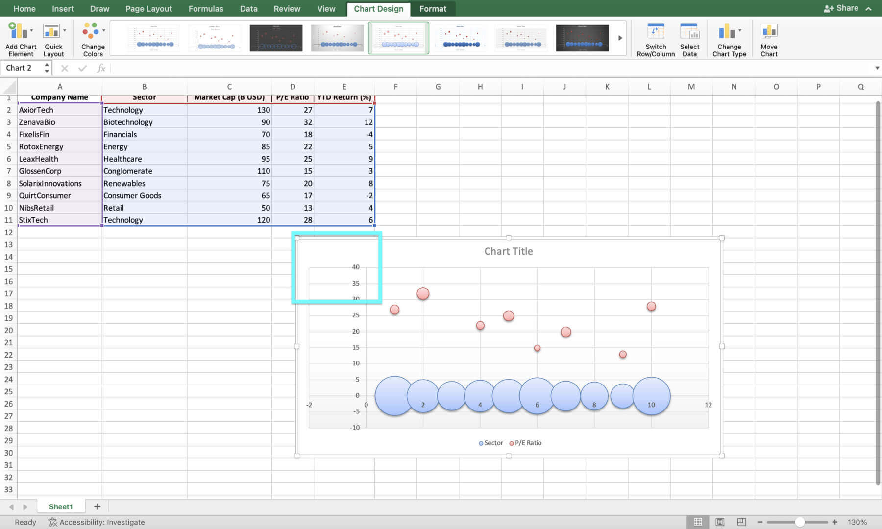
6. Customize the X-axis and Y-axis labels. To do this, right click on the respective axis and select “Format Axis”. Adjust the minimum and maximum values, tick mark spacing, and label positioning as needed.


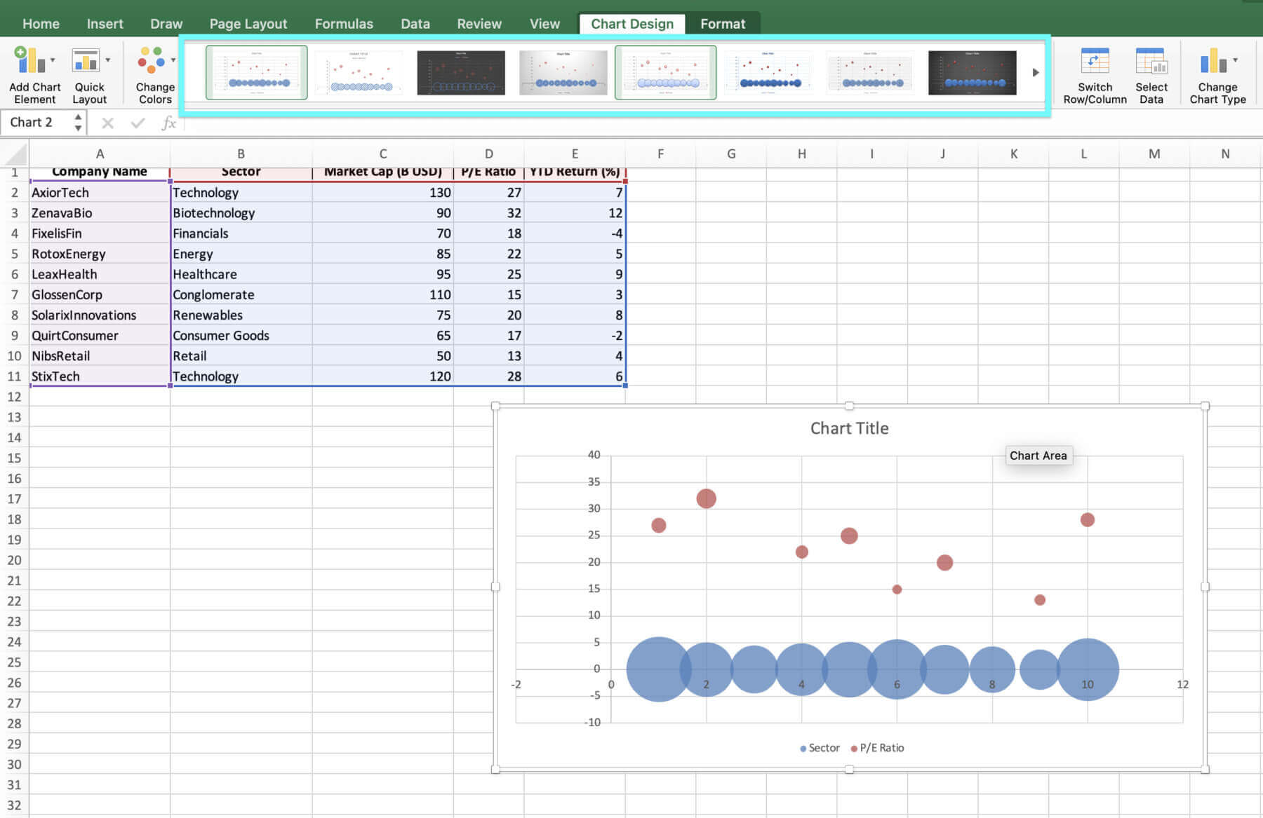
7. To change the chart design, simply click on the chart and select from the Chart Designs.


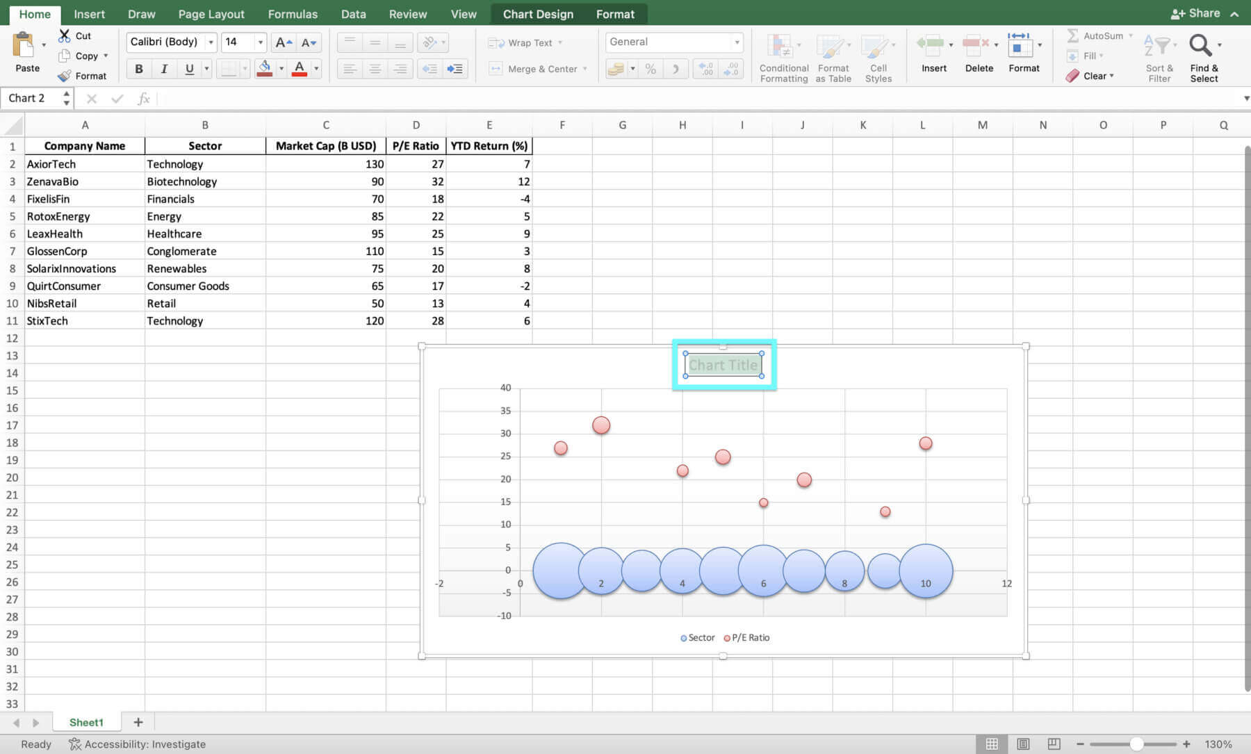
8. To change the Chart Title, click on it and type your desired title.


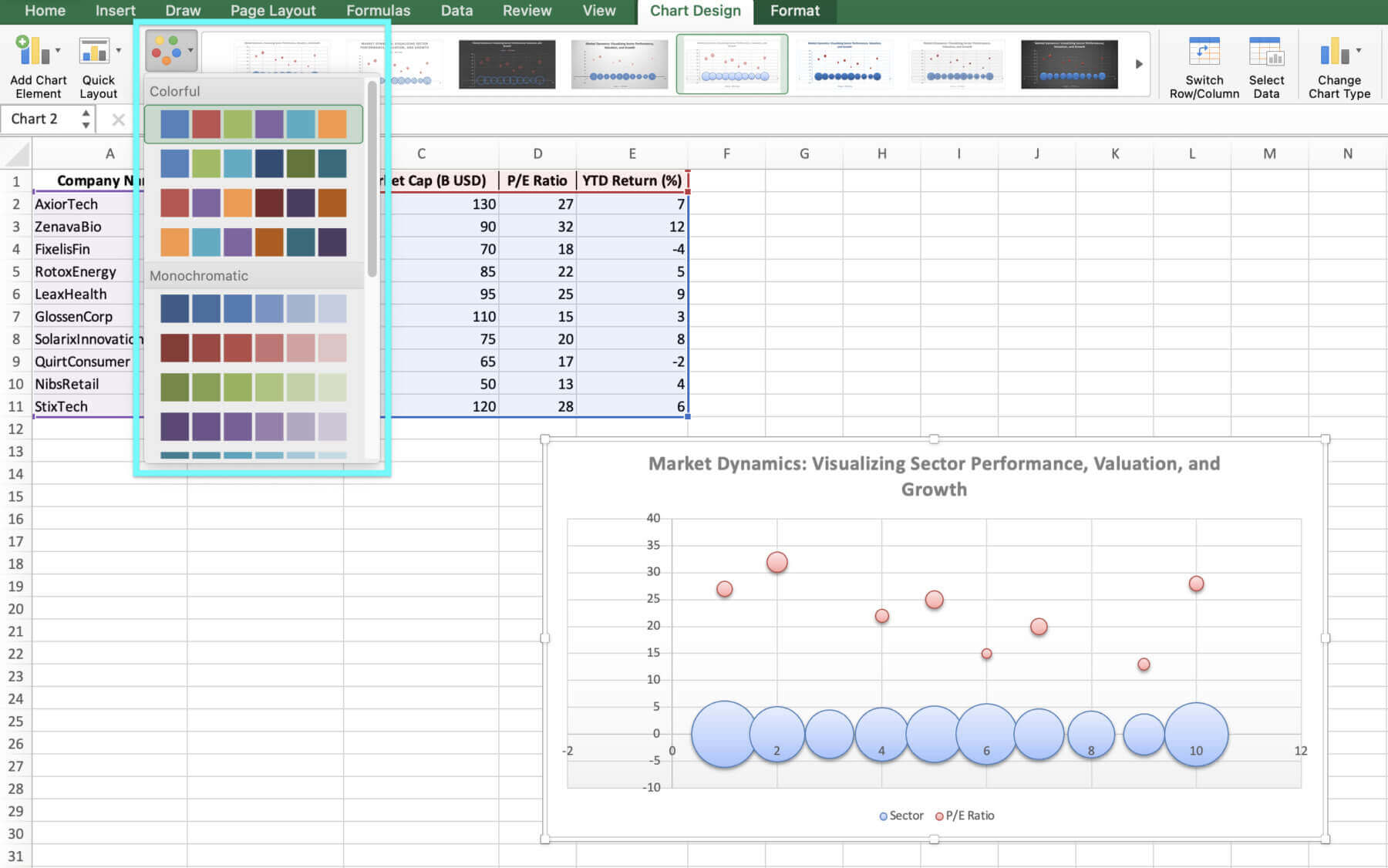
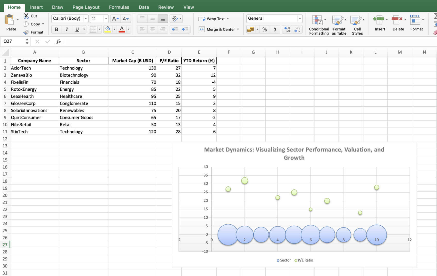
9. To change the color scheme, click on the dropdown button on “Change Colors” and select your desired color.


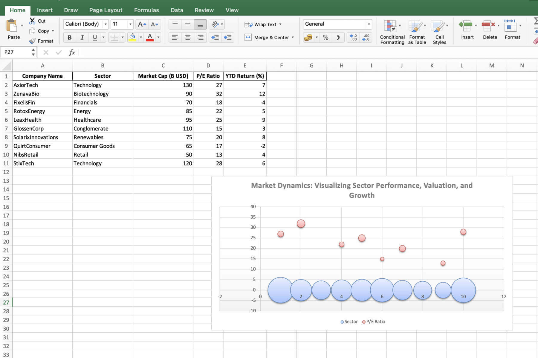
That’s it! You’ve now created a customized bubble chart.
Key Considerations When Interpreting the Bubble Chart
To interpret the bubble chart, consider the following:
- The X-axis shows the price-to-earnings (P/E) ratio, which reflects the valuation of each company. Companies positioned further to the right have higher valuations.
- The Y-axis represents the year-to-date (YTD) returns, indicating the stock performance of each company. Firms higher up on the chart have achieved better YTD returns.
- The size of each bubble corresponds to the market capitalization of the respective company. Larger bubbles represent firms with higher market values.

