Enhancing Financial Analysis with Advanced Combo Chart Techniques
Here are some advanced techniques with combo charts to enhance your financial analysis.
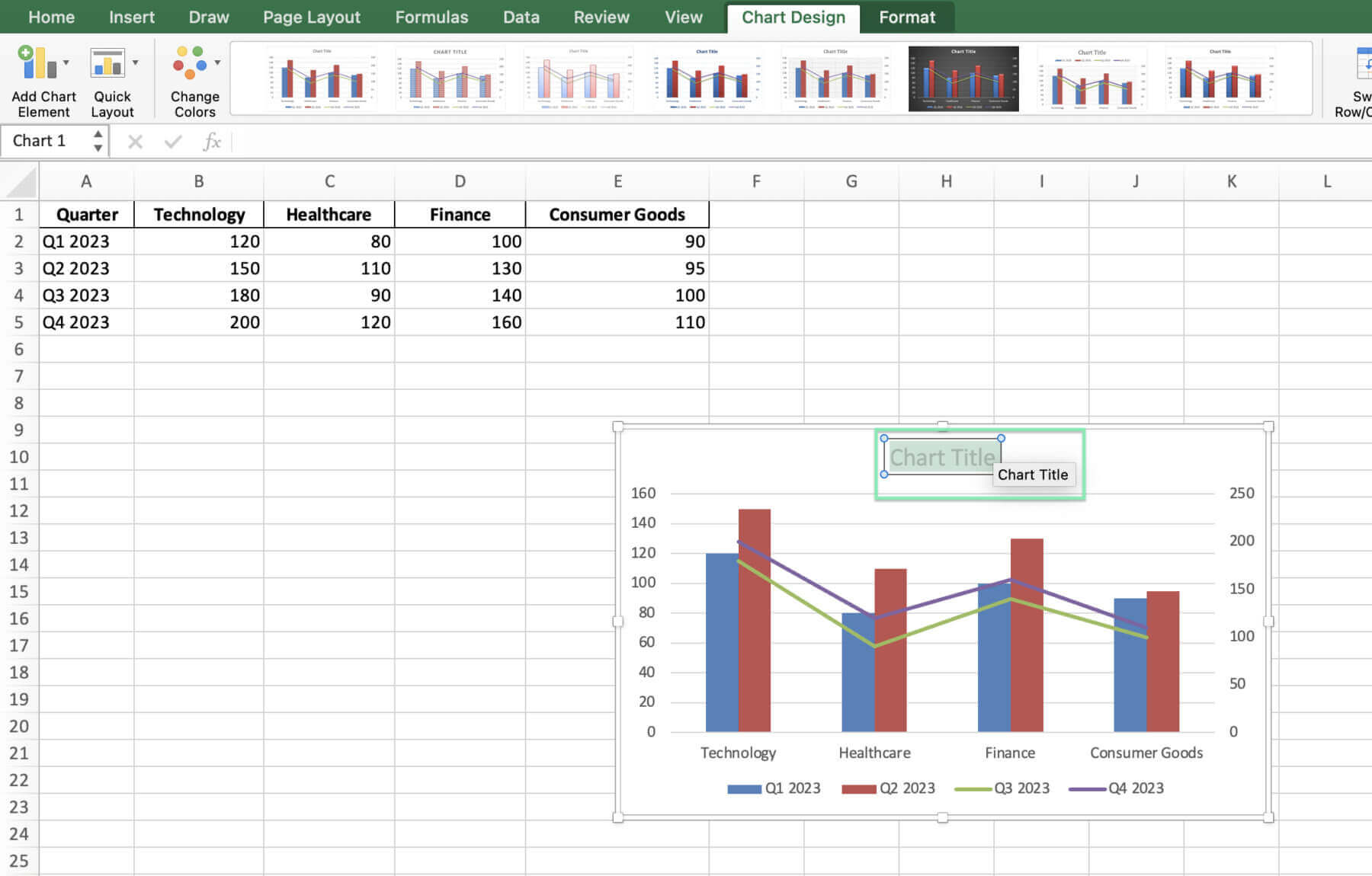
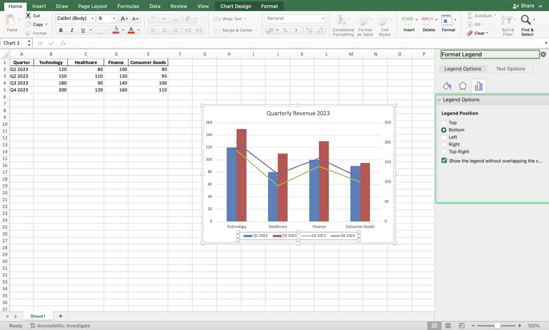
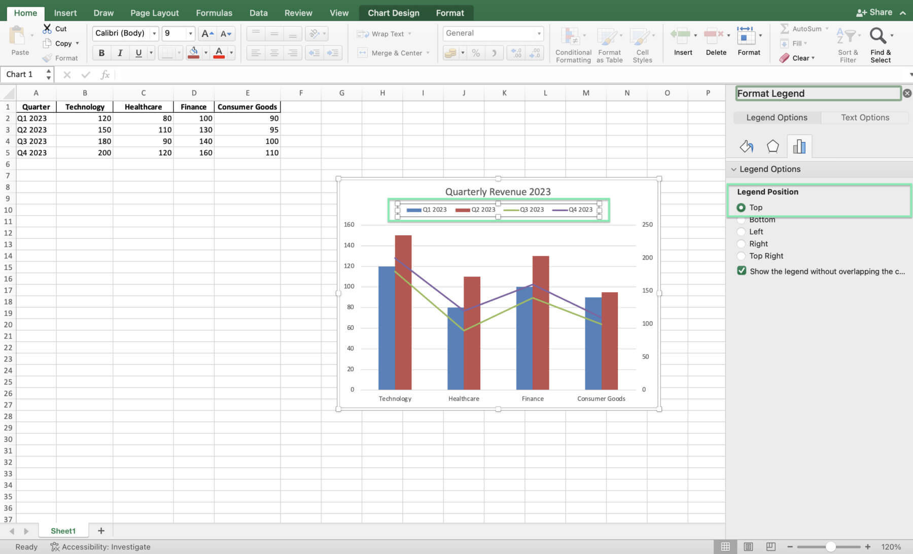
Incorporating Secondary Axes
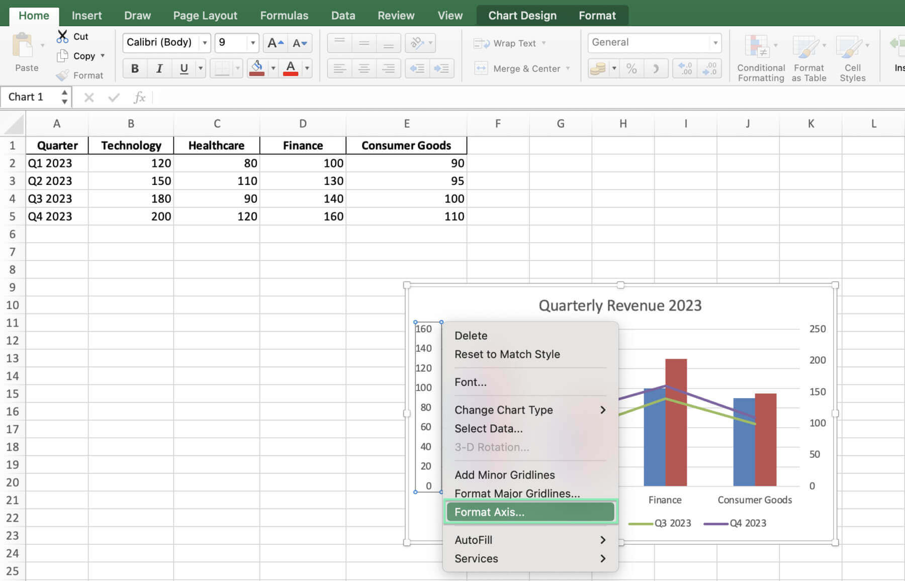
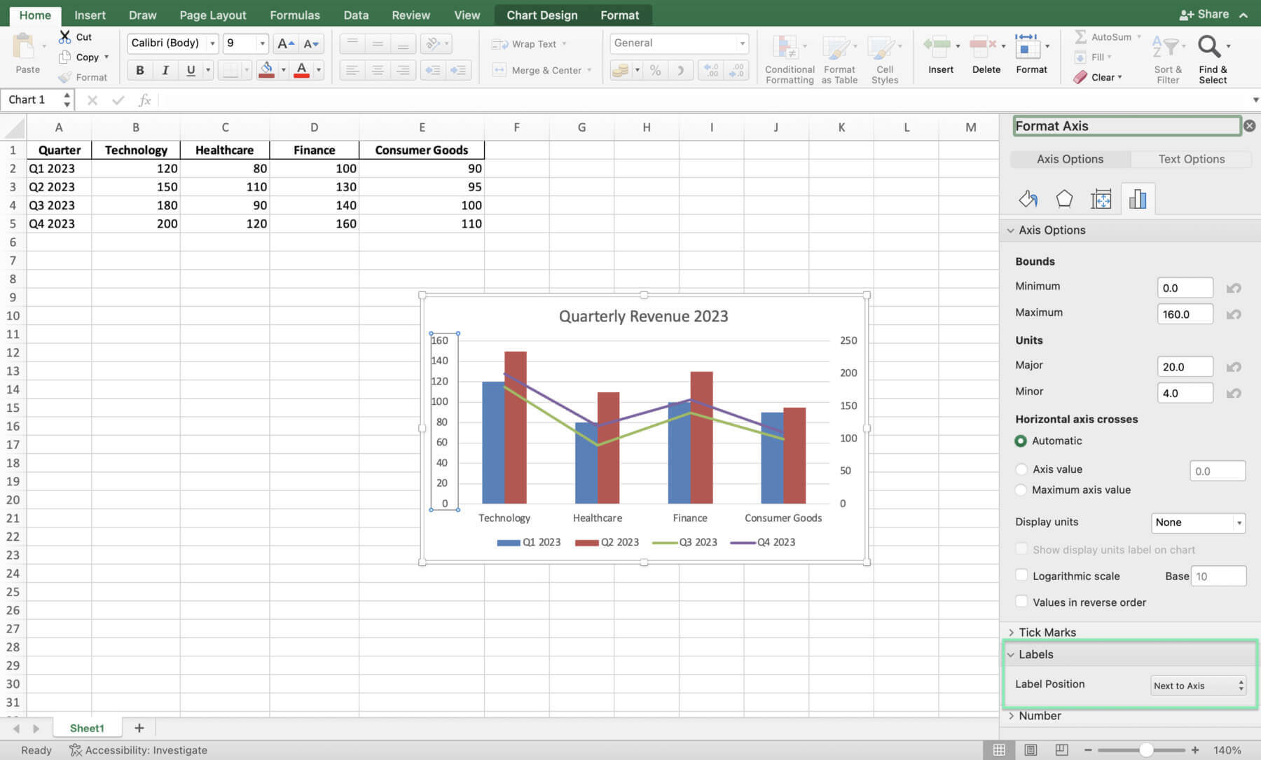
Adding a secondary vertical axis can be invaluable when visualizing data series with different scales. To do this:
1. Select the data series you want to plot on the secondary axis.
2. Right-click and choose ‘Format Data Series’.
3. In the ‘Series Options’ tab, select ‘Secondary Axis’ under the ‘Plot Series On’ section.
4. Customize the secondary axis as needed to ensure proper scaling and formatting.
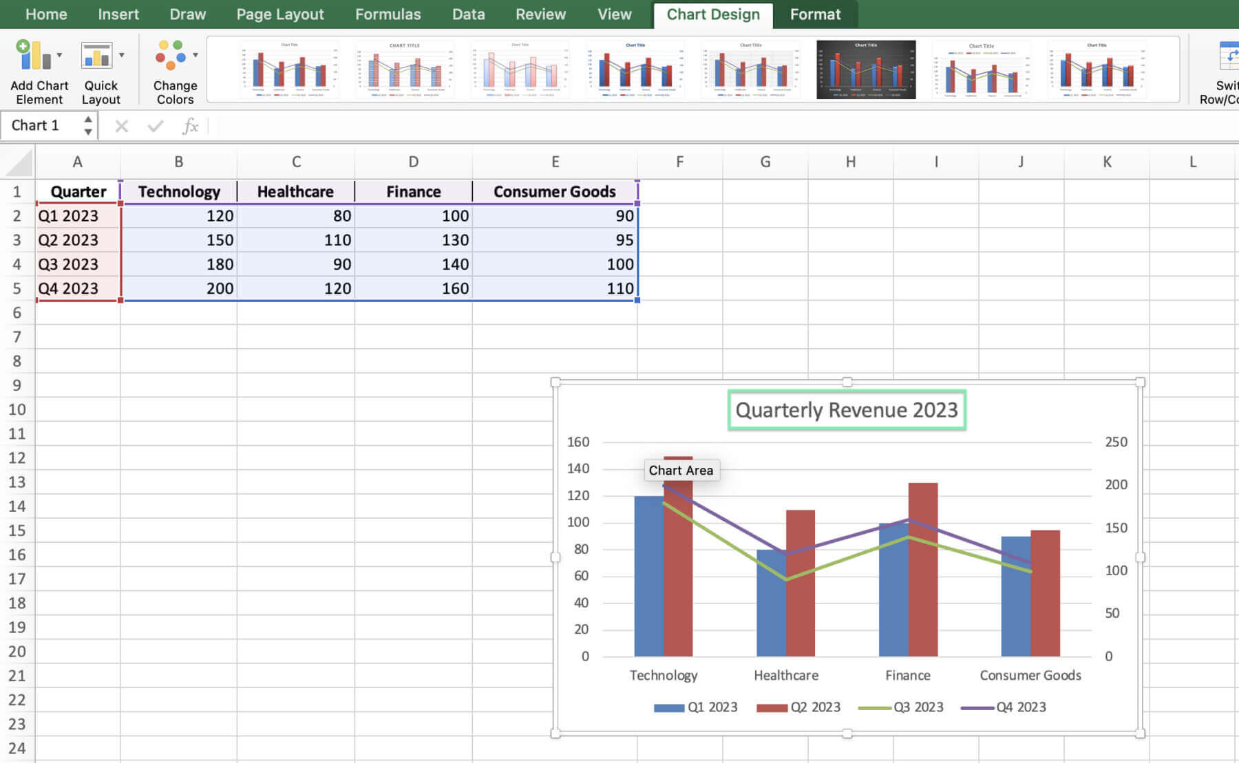
Analyzing the Financial Combo Chart
With your combo chart complete, you can now analyze the data to derive valuable insights:
1. Identify trends: Look for consistent patterns in revenue growth or decline across sectors over time.
2. Compare performance: Assess which sectors are outperforming or underperforming relative to others.
3. Spot anomalies: Identify any unusual spikes or drops in revenue that may require further investigation.
4. Evaluate diversification: Determine whether your investment portfolio is well-balanced across sectors based on their relative performance.
Dynamic Charts for Ongoing Analysis
To create a combo chart that automatically updates as new financial data is added:
1. Set up your data table with formulas that reference the source data.
2. Select your data range and create your combo chart.
3. As new data is added to the source, refresh the chart data by right-clicking on the chart and selecting ‘Refresh Data’.
Highlighting Key Data Points
To emphasize significant financial achievements or concerns within your combo chart:
1. Select the data point you wish to highlight.
2. Right-click and choose ‘Add Data Label’.
3. Customize the data label style, position, and format to draw attention to the key point.
Before we wrap up, a few parting words of wisdom for my fellow finance pros.
Tips for Finance Professionals
Check out the following tips to help you create the best combo charts:
Design Considerations for Financial Presentations
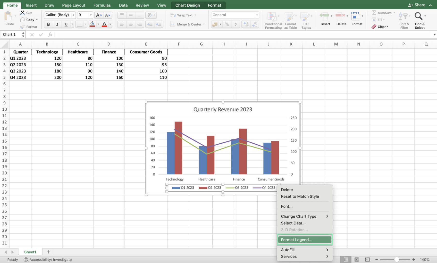
When creating combo charts for financial presentations, keep these best practices in mind:
1. Choose a clear, readable font: Ensure that your chart text is easily legible, even from a distance.
2. Use contrasting colors: Select colors that provide sufficient contrast between data series and background elements.
3. Keep it simple: Avoid cluttering your chart with too many data series or unnecessary embellishments.
Performance Optimization
When working with large financial datasets in Excel, performance can sometimes suffer. To optimize your combo charts:
1. Use named ranges: Define named ranges for your data series to make formulas more efficient and readable.
2. Avoid excessive formatting: Minimize the use of complex cell formatting, conditional formatting, and chart effects that can slow down performance.
3. Leverage Excel’s built-in tools: Utilize Excel features like PivotTables and Power Query to efficiently manage and analyze large datasets.
Hit a snag? Don’t sweat it; here’s how to tackle common hiccups.
Troubleshooting Common Charting Challenges in Finance
Even experienced finance professionals may encounter issues when creating combo charts. Here are some common challenges and their solutions:
1. Scaling issues: If your data series have vastly different scales, use a secondary axis or consider logarithmic scaling to ensure proper visualization.
2. Data series misalignment: Double-check that your data ranges are correctly defined and that each series has the same number of data points.
3. Incorrect representation of financial ratios: Ensure that your chart types and axis settings accurately reflect the nature of your financial ratios (e.g., percentages, decimals, etc.).
Alright, let’s bring it all home with some final thoughts on combo charts in finance.
Using Quick Charts by Macabacus
Creating charts in Excel can be a daunting and time-consuming task, especially for those in finance and consulting. The Quick Charts tool from Macabacus revolutionizes the process by automating much of the complexity. With just a few clicks, you can generate professional charts, saving you valuable time and effort.
When you create a new Quick Chart, Macabacus presents a preferences dialog where you can set your desired formatting, labeling, and orientation, sizing options. The preferences are saved for future use, streamlining your workflow even further.
Additionally, most Quick Charts offer in-worksheet customization options, allowing you to tweak the chart’s appearance later, even without Macabacus installed. You can try Macabacus anytime and experience the efficiency of Quick Charts for yourself!
Conclusion
Now, you’re ready to create powerful combo charts that will help you analyze and compare financial data, aiding in your decision-making process. Remember, the key is to have a deep understanding of your data, select the most relevant key performance indicators, and adhere to data preparation and chart design best practices. By mastering the art of creating combo charts in Excel, you’ll be well-equipped to make data-driven decisions that will impress your colleagues and clients.
Feel free to experiment with various chart styles and configurations to find the most effective way to communicate your insights. If you want to take your charting skills to the next level, explore advanced tools and resources like Macabacus, which can help you create even more sophisticated and dynamic visualizations.
Sign up for a free 14-day trial of Macabacus today and master the art and science of making charts!
Whether you’re a seasoned finance professional or just starting out in your career, continue to hone your skills and apply the knowledge you’ve gained from this comprehensive guide. By doing so, you’ll be able to create action-driving combo charts that provide valuable financial insights and drive better results.
Happy charting!


