Creating Personalized Histograms for Financial Analysis
The most efficient way of creating a histogram that actually works for investment banking in Excel is to use the existing chart options and do some modifications.
Adjusting Bin Range
One of the key features of a histogram is the number and range of bins since it is the particular factor that demonstrates the data grouping and display. In Excel, the bin limit can be customized and adaptable to meet the diverse representation needs of your financial information.
To adjust the bin range:
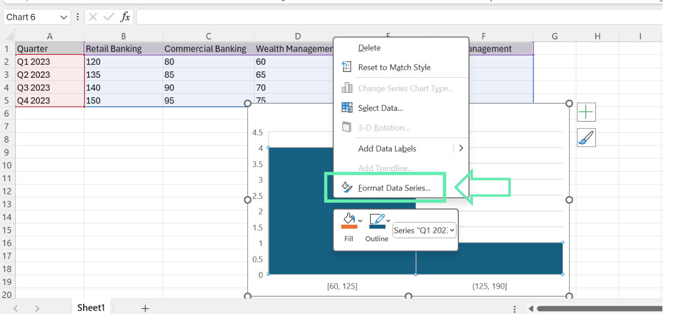
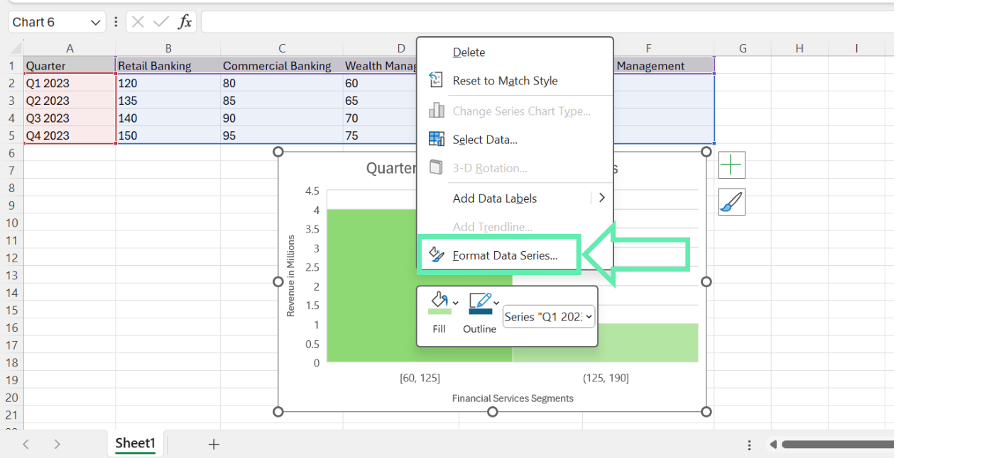
Step 1: In the histogram, right-click on any bar and select ‘Format Data Series’ from the context menu.

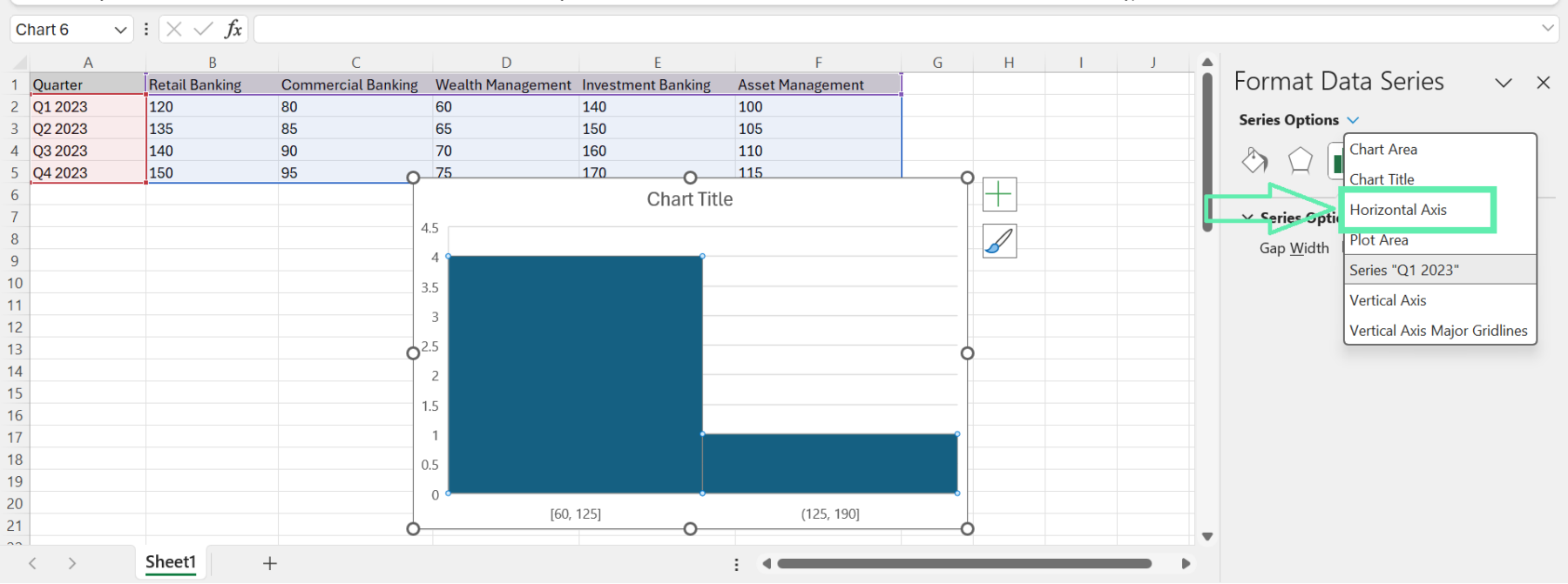
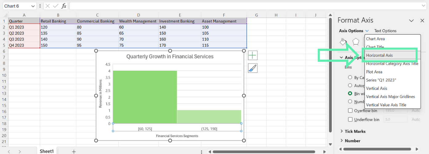
Step 2: In the ‘Format Data Series’ panel, click the ‘Series Options’ drop-down menu and select the ‘Horizontal Axis’ category.

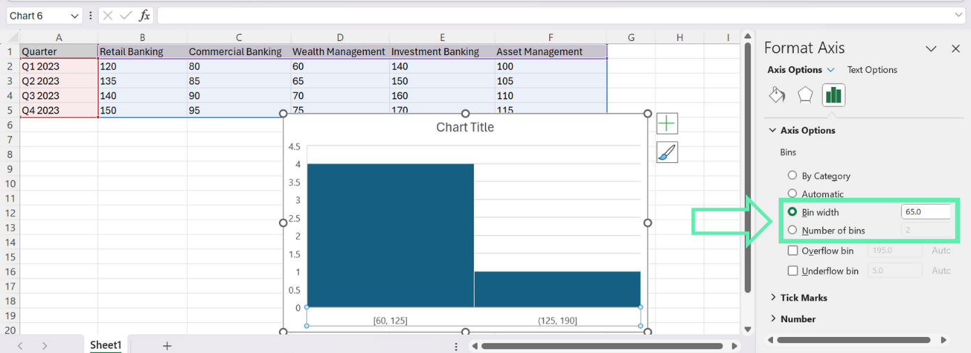
Step 3: Adjust the ‘Bin width’ or ‘Number of bins’ parameters to your desired level. Using a smaller bin width or a higher number of bins will create a more detailed distribution of the data, while large bin widths and lower numbers of bins will provide a more summarized illustration.

The nature of the finance data and the level of detail desired for the analysis will determine the optimum bin range. For instance, a narrower bin width is needed in cases such as the analysis of investment returns where there are groups of returns or outliers. On the other hand, when analyzing revenue data, a wider bin width would help to show the overall distribution of revenue.
Enhancing Chart Design
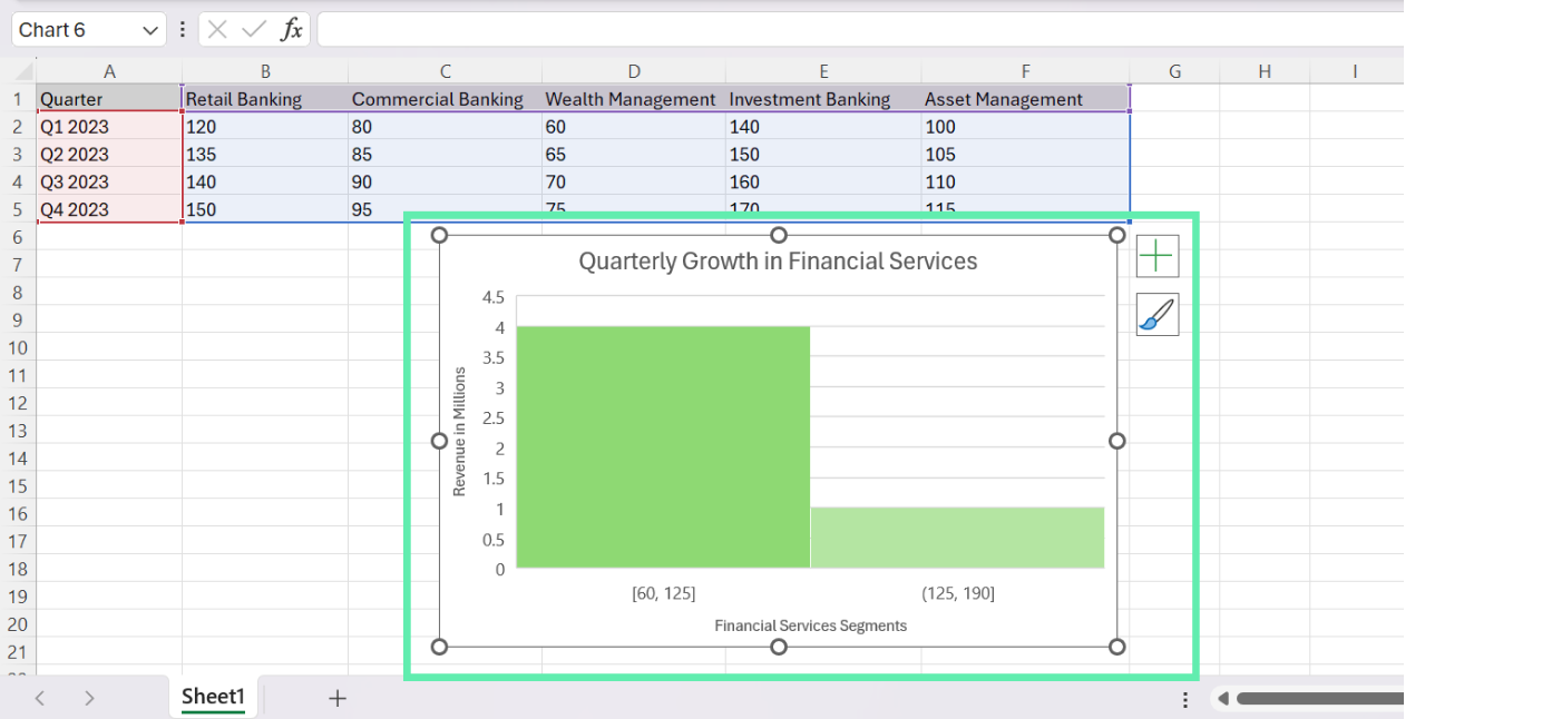
You would want the histogram to be visually striking and easy to understand, so the design elements of the histogram can be customized to match your bank’s branding and presentation guidelines.
Consider making the following adjustments:
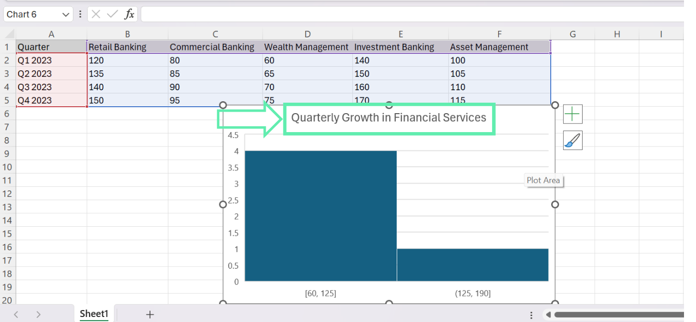
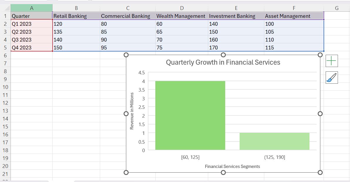
1. Chart Title: Change the chart title so it is easily understood and to indicate the purpose and scope of the analysis, eg, ‘Quarterly Growth in Financial Services.’

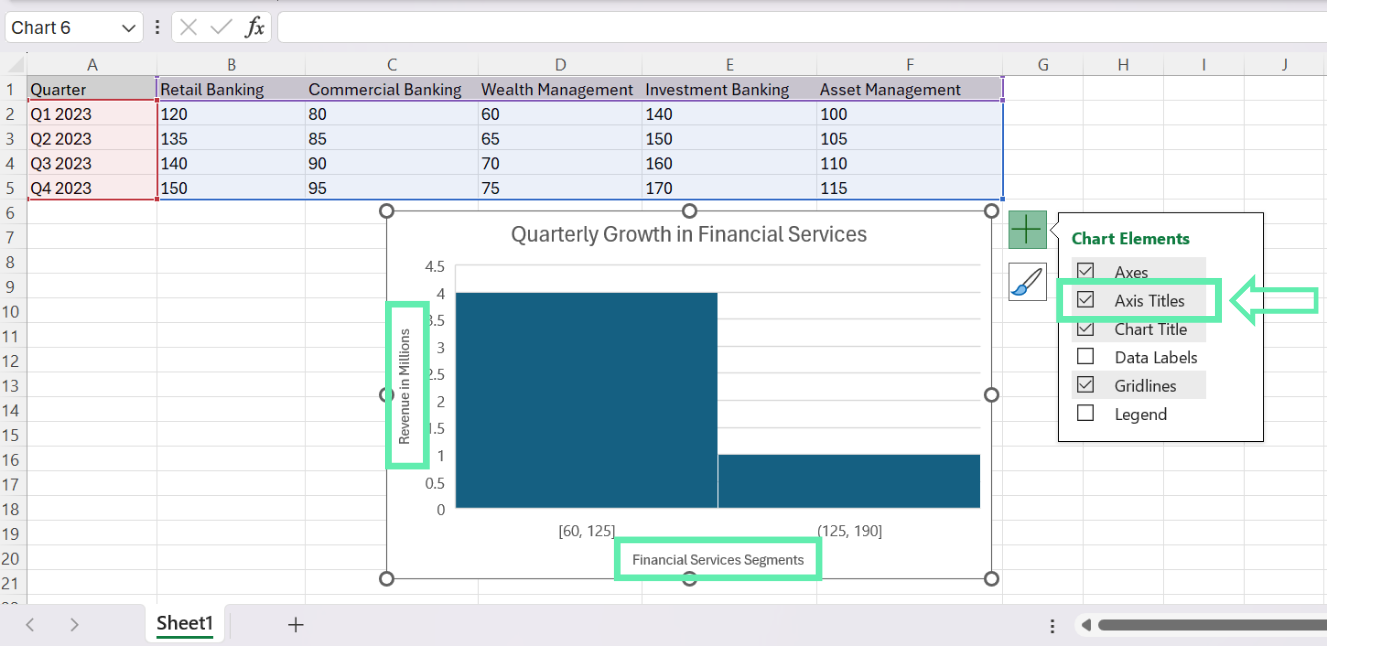
2. Axis Labels: Check that the horizontal and vertical axis labels rightly correspond to the data being depicted. Change the font size and styling to facilitate good reading. To insert Axis Titles, click the chart > + sign, then click ‘Chart Elements’ and check the ‘Axis Titles’.

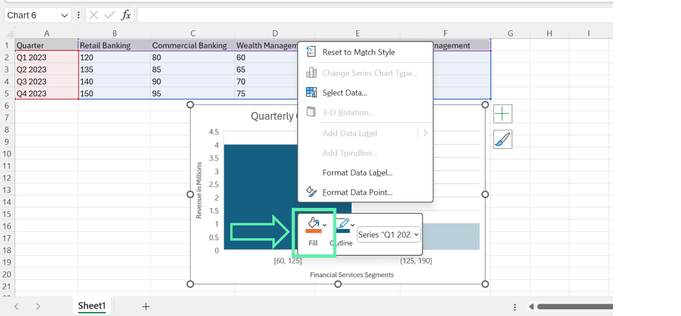
3. Color Scheme: Select the color scheme that matches your investment bank’s branding guidelines and that is used for the enhanced visual appearance of the chart. To change colors, right-click on each data series. Select ‘Fill’ and choose a color.


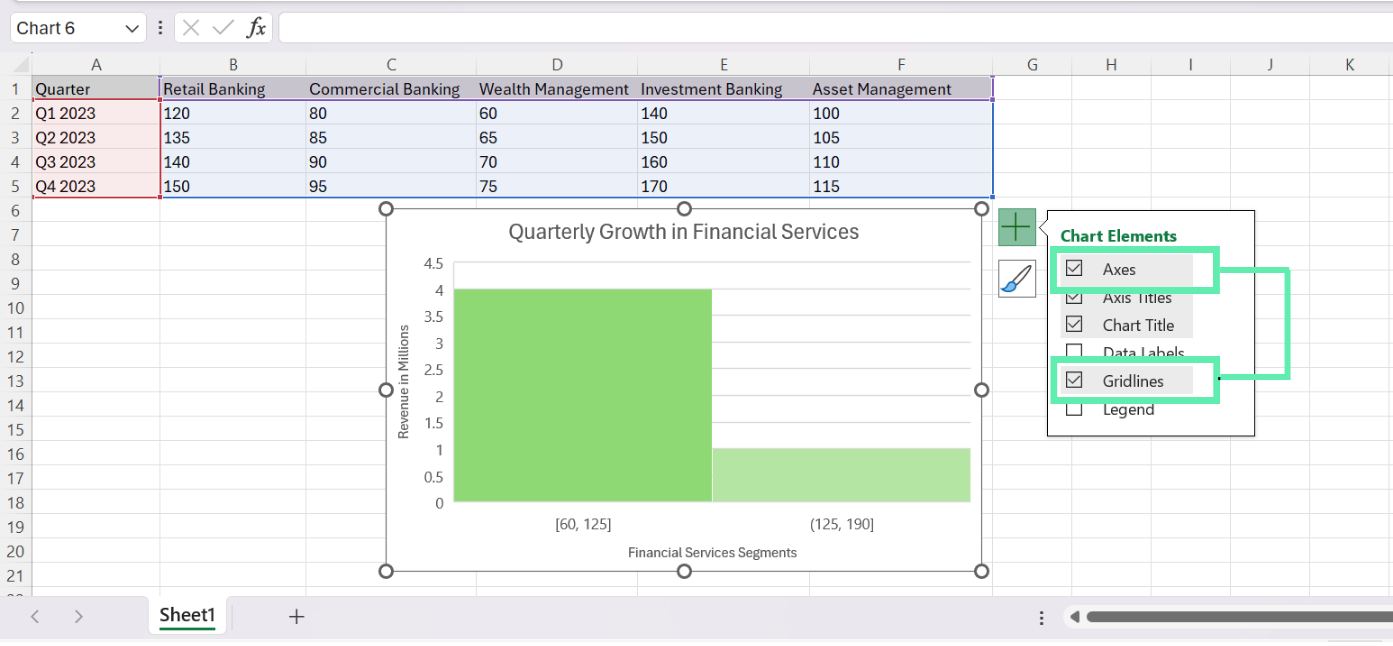
4. Gridlines and Axes: Review whether the default grid lines and the axes are helpful for your analysis. In some instances, removal or modification of these elements can make the chart clutter-free and highlight the critical information.

Advanced Histogram Features for Investment Analysis
To further enrich your histogram analysis, Excel offers several advanced features particularly relevant to investment banking.
Overflow and Underflow Bins
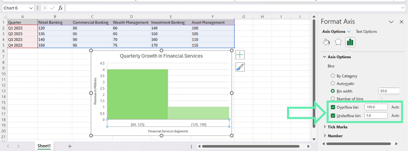
When analyzing financial datasets that contain outliers, extreme values, such as investment returns or asset prices, can be useful by the inclusion of overflow and underflow bins. These bins have set parameters that are above or below a specified bin range, thereby ensuring that these data points are not skewing the whole underlying distribution.
To enable overflow and underflow bins:
1. Just click the right-click function with any bar in the histogram, and then select the option ‘Format Data Series’.

2. In the ‘Format Data Series’ pane, go to the ‘Horizontal Axis’ category.

3. Choose ‘Overflow bin’ and ‘Underflow bin’ where it is required. Enter your preferred figures.

Gap Width Adjustments
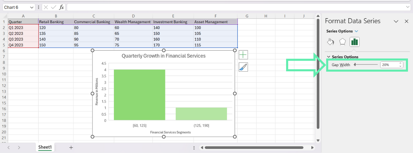
By default, Excel sets the gap width between histogram bars at 150%. But, you can customize this value for charting purposes and highlight the distribution of your financial data.
To modify the gap width:
1. Right-click on any bar in the histogram, and choose the Format Data Series option.

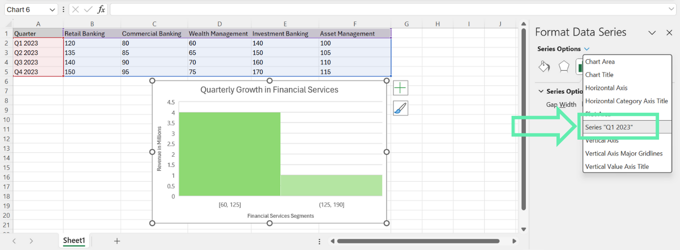
2. On the ‘Format Data Series’ panel, choose the ‘Series Options’ category.

3. Adjust the ‘Gap Width’ lever to the level you prefer. A lower gap width will make more narrow bars that are next to each other, whereas a larger gap width will show the bars that are farther away from each other.

Common Pitfalls in Financial Data Visualization and How to Avoid Them
When creating histograms for financial analysis, there are several common pitfalls to be aware of, such as:
Data Display Issues
Before creating a histogram for your financial data, it is important to make sure that the data is properly formatted and error-free. If there are any inconsistencies or inaccuracies in your data, the resulting representations of the distribution will be inaccurate or misleading.
Below are a some best practices that you need to remember:
- Verify your data for any values that are missing or not properly formatted.
- Make sure that all values in your data are arranged systematically (e.g., everything is in the same unit of measurement).
- If needed, use the Excel function to clean and preprocess your data and then create a histogram.
Interpretation Challenges
Histograms of financial data distribution can be a powerful tool, but you must find the correct way to interpret it to avoid false conclusions.
Here are a few guidelines for accurate interpretation:
- Be aware of the scale of the horizontal and vertical axes to make sure that you’re interpreting the magnitude of the distribution accurately.
- It is important to understand the context of your financial data when making conclusions. There may be external factors or assumptions in the background that can form the structure of the distribution.
- Utilize histograms together with other statistical indicators (e.g., the mean, the median, the standard deviation) to get a more holistic view of your data.
Case Study: Analyzing Quarterly Revenue for Investment Strategies
To reinforce the concepts covered in this tutorial, let’s apply them to our sample dataset and analyze the quarterly revenue trends across different banking segments.
Creating the Histogram
- Select the data range for the banking segment you want to analyze (e.g., Investment Banking).
- Follow the steps outlined in the ‘Creating a Basic Histogram’ section to insert a new histogram chart.
- Customize the bin range, gap width, and design elements as described in the “Customizing Your Histogram” section.

Interpreting the Results
Upon reviewing the histogram, you can draw several insights:
- The distribution of quarterly revenue for the selected banking segment (e.g., Investment Banking) appears to be relatively normal, with most values clustered around the center.
- The histogram reveals any potential outliers or extreme values that may warrant further investigation.
- By comparing histograms for different banking segments, you can identify which segments have more consistent revenue streams and which ones exhibit greater variability.
Applying Insights to Investment Strategies
Based on the insights gleaned from the histogram analysis, investment bankers can make more informed decisions and provide strategic advice to clients. For example:
- If the Investment Banking segment shows a consistent, normal distribution of quarterly revenue, this may indicate a stable and predictable revenue stream, which could be attractive to investors seeking steady returns.
- If the histogram reveals significant outliers or variability in a particular segment’s revenue, investment bankers may recommend strategies to mitigate risk or capitalize on potential opportunities.
- By comparing the revenue distributions of different banking segments, investment bankers can help clients diversify their portfolios and allocate assets based on their risk tolerance and investment objectives.
Final Reminders
- Ensure that your data is well-structured and in the right format before you input it into the Excel software.
- Customize your histogram’s bin range and specify the graph elements that you want accordingly for a solid financial analysis process.
- Apply advanced features like overflow/underflow bins and gap width modifications in order to extend the fields of your analysis.
- Make sure to avoid consistently used data presentation and interpretation errors.
- Apply the histograms alongside the other statistical measures to have a deeper understanding of your financial data.
Using Quick Charts by Macabacus
Creating charts commonly used in finance and consulting can be complex and tedious when relying solely on native Excel functionality. Macabacus’ Quick Charts revolutionizes the process, automating the creation of the charts and reducing the effort to just a few mouse clicks.
With Quick Charts, you can easily set your preferences for orientation, sizing, formatting, and labeling through an intuitive dialog box. Macabacus remembers the preferences for your future charts, streamlining your workflow.
Additionally, most Quick Charts come with in-worksheet options that let you customize the chart’s appearance later on, even if Macabacus is no longer installed. Experience the efficiency and ease of using Quick Charts by checking out Macabacus now.
Conclusion
Histograms act as a powerful tool for finance professionals whose goal is to analyze and interpret financial data distributions. By applying the steps given in this blog, you will be able to create attractive and informative histograms using Excel and enhance data-driven decision-making.
Through the mastering of histogram making and interpretation in Excel, investment bankers will be able to discover useful information, give clients valuable strategic advice, and, consequently, allow for more informed decision-making in the finance industry. If you want to take your histogram charts to the next level, try Macabacus.
Happy chart-making!


