Preparing Data for Line Charts in Excel
Before creating a line chart in Excel, you need to organize and format the data you’ll use.
Selecting and Organizing Data Sets for Input into Excel
The first step is to identify the specific information you want to showcase in your line chart. What trends or relationships are you trying to illustrate? Once you know your goal, you can identify the data that best supports it.
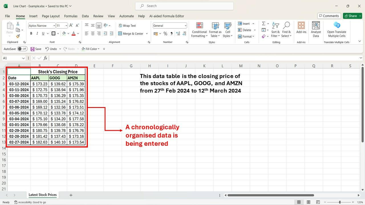
Make sure your data is organized in a clear table format. Each column should have a relevant header that describes the data it contains. This clarity will be crucial for both you and anyone interpreting the chart later.
Typically, the leftmost column represents the independent variable. This could be categories, time periods, or any factor you’re measuring against. The subsequent columns represent the dependent variables, which are the data series you’ll be plotting on the chart. These represent the values that change based on your independent variable.
Cleaning and Formatting Data for Accurate Representation
Data accuracy is essential! Double-check your entries for any errors or inconsistencies. Ensure all values are entered correctly to avoid misleading visuals.
Apply appropriate formatting to your data as well. Dates should be formatted as dates, and numerical data should have consistent decimal places. This formatting ensures the chart interprets the values correctly and presents them accurately.
Additionally, remove any unnecessary characters or special symbols that might throw off the chart’s accuracy. Numbers should be presented cleanly for the chart to read without errors.
Ensuring Data Consistency and Relevance for Creating Meaningful Line Charts
Before finalizing your data preparation, take a moment to verify that the data you’ve chosen is relevant to the trends or relationships you want to convey in your line chart. Does the data tell the story you intend?
Finally, double-check the units of measurement across all your data series. Inconsistency in units (e.g., some values in dollars, others in euros) can lead to misleading interpretations of the chart. Make sure everything is measured in the same way for clear and accurate visualization.
Step-by-Step Guide to Creating a Line Chart in Excel
Here’s a step-by-step guide on how to create a line chart in Excel:
1. Launch Excel and Prepare Your Workspace
- Open Excel and choose a new blank workbook for a fresh start.
- Alternatively, open an existing workbook containing your data and select the relevant worksheet.
2. Input Your Data
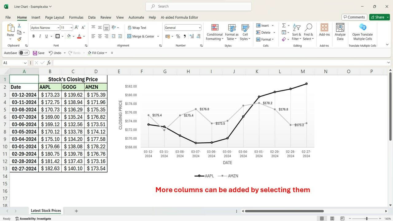
- Enter your data in columns or rows, with each column representing a separate variable.
- Organize your data logically, chronologically for time series, or by category for comparisons.
- Label your columns or rows with clear headers to identify the variables or categories.

3. Select Data and Insert the Chart
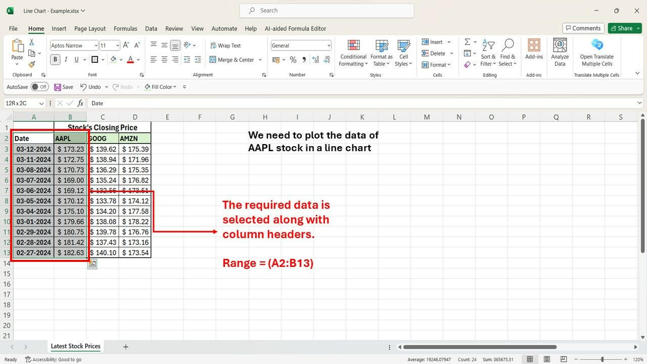
- Highlight the range of cells containing your data, including any headers.
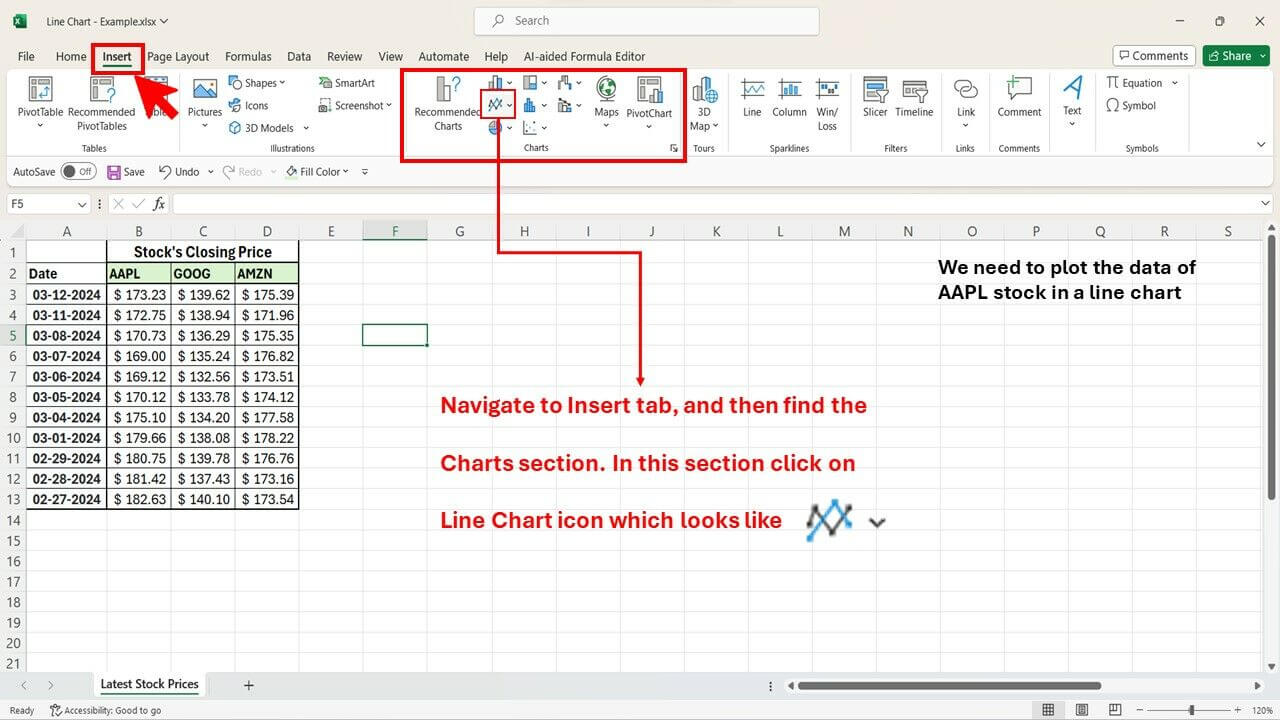
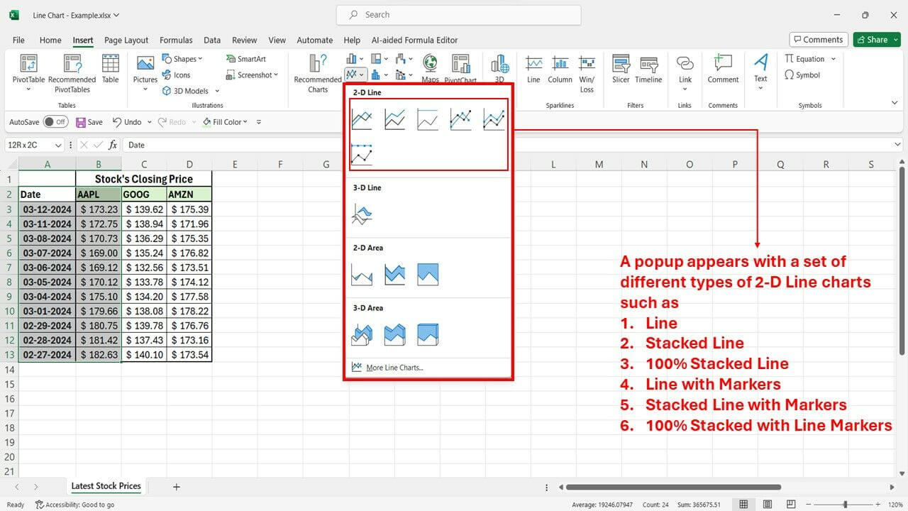
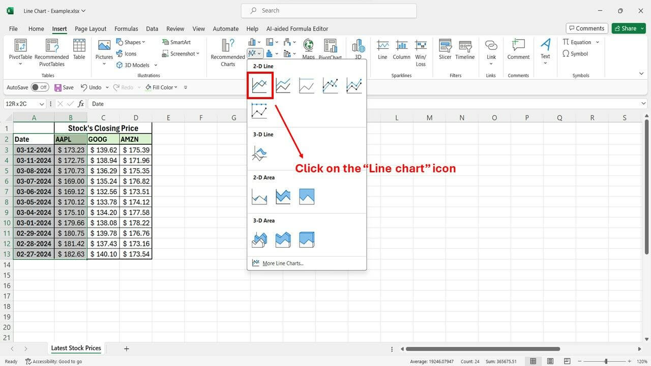
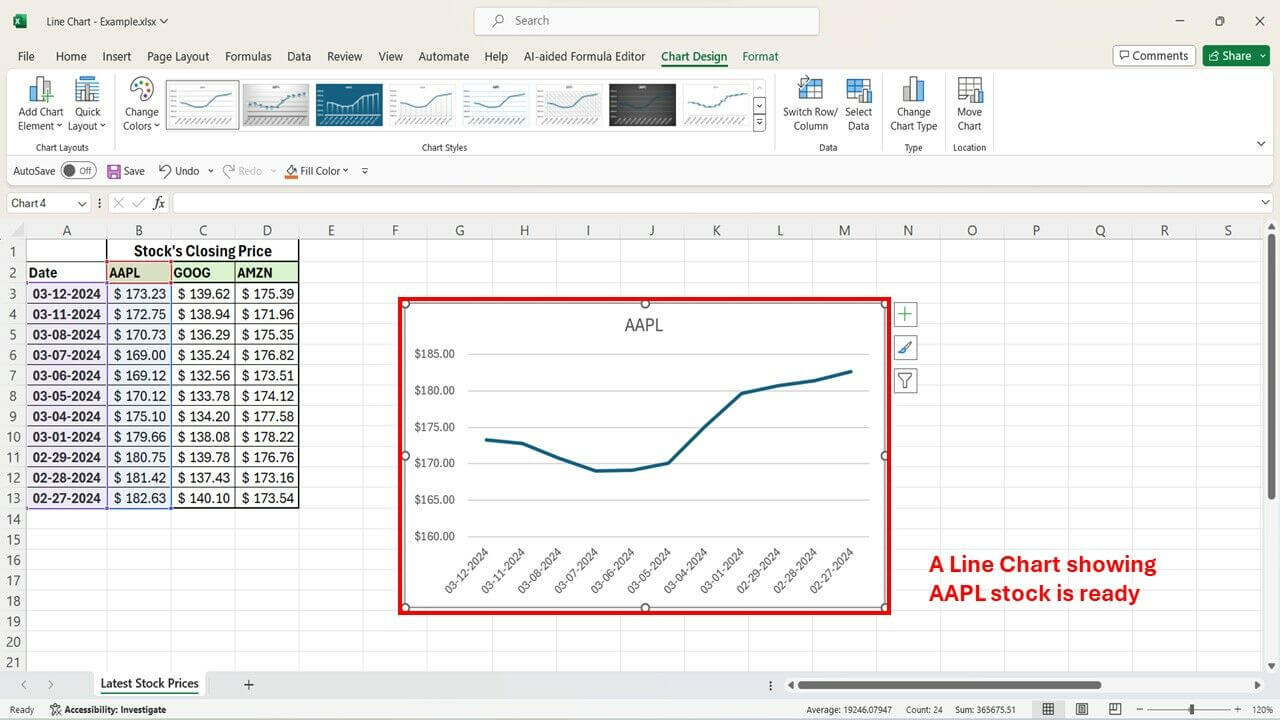
- Navigate to the “Insert” tab and locate the “Line” or “Line with Markers” icon within the “Charts” group. Click it to generate a basic line chart.


4. Customize Chart Elements (Titles & Labels)
- Add a descriptive title by clicking on the default “Chart Title” and entering your desired text.
- Modify the x-axis and y-axis titles by clicking on their respective text boxes and entering clear labels.
- Right-click on an axis and select “Format Axis” to adjust the scale and formatting (minimum/maximum values, tick marks, etc.).


5. Format the Chart for Clarity
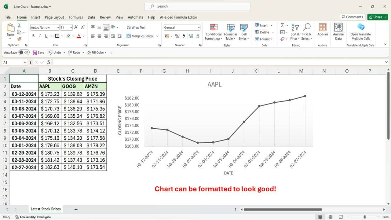
- Utilize formatting options to enhance visual appeal. Modify line styles, colors, and markers to differentiate data series.
- Improve readability by adding gridlines or adjusting the chart and plot area settings.
- Consider including chart elements like legends, data labels, or annotations for additional context.
By following these steps and exploring Excel’s formatting options, you can create effective line charts that communicate your data insights clearly.

Enhancing Line Charts with Advanced Features in Excel
You can use Excel’s advanced features to enhance your line charts. Here are several ways on how to do it:
Adding Trendlines to Analyze Patterns and Forecast Trends
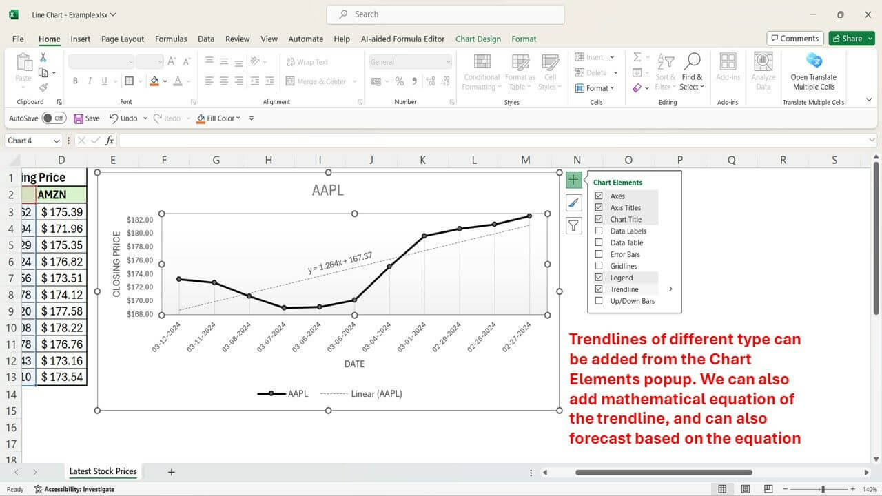
- Click on the chart to activate the Chart Design tab.
- In the Analysis group, click the Trendline button.
- Choose the appropriate trendline type based on your data, such as linear, exponential, or polynomial.
- You can format the trendline appearance and display the trendline equation for further analysis.

Incorporating Data Labels, Markers, and Annotations for Better Interpretation
- Data Labels: As mentioned earlier, data labels display specific data points on the chart. You can customize their format and placement.
- Markers: Markers visually represent data points on the line. Utilize different marker shapes and colors to differentiate data series.
- Annotations: Add text boxes, arrows, or callouts to highlight specific areas of the chart or provide additional information.
Using Color Schemes Effectively to Differentiate Multiple Lines in the Chart
Excel offers a variety of predefined color schemes or allows you to create custom color palettes. Choose visually distinct colors and avoid using too many colors, especially for audiences with color vision deficiencies.
Key Steps and Best Practices for Creating Line Charts in Excel
- Prepare your data by selecting relevant sets, ensuring accuracy, and formatting consistently.
- Insert a line chart and customize the chart elements (titles, axes, labels) for clarity.
- Explore formatting options to enhance visual appeal and data differentiation.
- Utilize advanced features like trendlines, annotations, and color schemes for deeper insights.
Practice and Experiment with Creating Dynamic Visualizations
The more you practice creating line charts, the more comfortable you’ll become with customizing them for specific data and audiences. Experiment with different layouts, colors, and data presentations to find the most effective way to communicate your message.
Tips and Tricks for Optimizing Line Charts in Excel
Learn about the different tips and tricks on how to optimize line charts in Excel below:
Adjusting Axis Scales and Formats for Better Visualization
- Axis Scales: You can adjust the scale of your axes to zoom in on specific data ranges or ensure all data points are displayed effectively.
- Axis Formatting: Format the axes to display gridlines, change the numbering format, or modify tick marks for better readability.
Utilizing Chart Tools and Features to Customize Appearance
- Experiment with different chart layouts and styles offered by Excel.
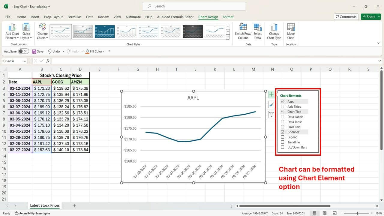
- Explore the Chart Elements button on the Chart Design tab to add elements like a legend or data table for further clarity.
Exploring Additional Options Like Smooth Lines or Stacked Lines for Varied Presentations
- Line Smoothing: Smooth lines can enhance the visual flow of the chart, especially for data with many data points.
- Stacked Lines: Stacked line charts are useful for comparing the cumulative contribution of multiple data series over time.
Common Errors to Avoid When Creating Line Charts in Excel
Be sure to take note of the following to avoid errors when creating line charts in Excel:
Misinterpreting Data Due to Incorrect Formatting or Input Errors
The foundation of a good line chart is accurate data. Double-check your entries for typos or inconsistencies. Ensure proper formatting is applied – dates should be formatted as dates, numbers should have consistent decimal places, and units of measurement should be the same across all data series.
Inconsistent formatting can lead to misinterpretations of your chart, so a little attention to detail goes a long way. Additionally, clear and concise labels for your axes and data series are crucial to avoid any confusion for viewers of your chart.
Failing to Update or Refresh Data for Accurate Real-Time Analysis
If your line chart is linked to an external data source, like another spreadsheet or database, it’s important to refresh the chart to reflect the most up-to-date information. Outdated data can lead to inaccurate conclusions.
Consider using formulas within your data table. These formulas can automatically update the chart whenever the underlying data changes, ensuring you’re always working with the latest information and your chart reflects the most recent trends.
Examples of Effective Line Chart Usage in Business and Finance
Line charts become powerful tools for businesses and financial institutions to:
- Navigate Market Trends: By plotting stock prices or market indices over time, line charts reveal trends and pinpoint lucrative investment opportunities.
- Pinpoint Performance Drivers: Visualizing sales figures or revenue streams across various periods allows businesses to identify seasonal or cyclical patterns that impact performance.
- Benchmark Growth: Line charts can effectively compare the growth trajectories of multiple products, services, or business units. This side-by-side visualization helps evaluate relative performance and identify areas for strategic focus.
Using Quick Charts by Macabacus
Streamline your chart creation process with Macabacus’ Quick Charts, designed to simplify the complex and tedious task of generating charts commonly used in finance and consulting. With just a few mouse clicks, you can automate chart creation, saving valuable time and effort.
When you create a Quick Chart, a preferences dialog lets you set your desired formatting, orientation, labeling, and sizing. Macabacus saves your preferences for future use, ensuring consistency and efficiency. Plus, for most Quick Charts, you can customize the chart’s appearance later on, even if Macabacus is no longer installed. Check out Macabacus today and see how Quick Charts can transform your charting process.
Final Thoughts on the Power of Excel for Data Visualization and Analysis
Excel offers a user-friendly and powerful platform for creating impactful line charts. By following these steps and best practices, you can leverage the power of line charts to effectively showcase trends,
Want to take your line charts to the next level? Try Macabacus!
Macabacus is an Excel add-in designed to supercharge your data visualization capabilities. It streamlines the chart creation process, unlocks advanced customization options, and ensures data accuracy for professional-looking results.
Sign up for a free 14-day trial of Macabacus today and see the difference!
P.S. Don’t forget to explore the additional resources on the Macabacus website to learn more about its extensive features and how it can revolutionize your Excel workflow.

