How to Create a Radar Chart in Excel

How to Create a Radar Chart in Excel

Radar charts, or spider/star charts, let you compare lots of variables at once. In finance and investment analysis, radar charts compare portfolio performances across various KPIs. Investment bankers use these charts to quickly spot portfolio strengths and weaknesses, helping them make better decisions.


Understanding Radar Charts in Finance

A radar chart shows data with three or more variables starting from the same point. In the context of financial analysis, radar charts are used to compare the performance of different investment portfolios across multiple KPIs. Each KPI has an axis that goes from the chart’s center outward. The portfolios’ data points are plotted and connected to form shapes.

Benefits of using radar charts for portfolio comparison include:

  1. Visual comparison of multiple portfolios across several KPIs simultaneously
  2. Identification of strengths and weaknesses of each portfolio
  3. Facilitation of data-driven decision making
  4. Clear communication of complex data to stakeholders

Got a grip on the theory? Let’s dive into the nitty-gritty of getting our data chart-ready.

Build Financial Models in Minutes

Enterprise-Grade Financial Modeling used by 80,000+ professionals across Investment Banking, Private Equity, and Corporate Finance. Ensure consistency, accuracy, and efficiency across your entire organization.

Preparing Your Financial Data

To demonstrate how to create a radar chart in Excel for investment analysis, we will use an example dataset that compares three investment portfolios (Portfolio A, B, and C) across six key performance indicators:

  1. Return on Investment (ROI): Measures the gain or loss generated on an investment relative to the amount of money invested.
  2. Volatility: Measures the degree of variation of trading prices series over time. 
  3. Liquidity: Indicates how quickly an investment can be sold in the market without affecting its price.
  4. Diversification: Reflects the level of variety in the investment holdings to reduce risk.
  5. Tax Efficiency: Indicates how much of the investment returns are kept after taxes.
  6. Cost: Represents the expenses associated with managing and operating the investment portfolio.

The dataset values range from 0 to 100, where 100 represents the highest or best performance in that category, and 0 represents the lowest.

Criteria

Portfolio A Portfolio B

Portfolio C

Return on Investment (ROI) 85 75 65
Volatility 30 40 50
Liquidity 70 60 80
Diversification 90 60 70
Tax Efficiency 75 85 65
Cost 55 45 40

To prepare this data in Excel for creating a radar chart, organize it in a table format with the KPIs in the first column and the corresponding values for each portfolio in the subsequent columns.

Now that we’ve got our data lined up, let’s roll up our sleeves and start charting.

Download Excel Template

Download Template

Download Template

Radar Chart

Try Macabacus for free to accelerate financial modeling in Excel.

Step-by-Step Guide to Creating a Radar Chart

Here’s a step-by-step on how to use Excel to create a radar chart:

Step 1: Enter Your Data in Excel

1. Open Excel and pick a worksheet.

2. Start in cell A2 and put the KPIs in the first column.

3. Put portfolio names in the first row, starting at B1.

4. Enter each portfolio’s values under their names.

Step 2: Selecting the Data for Your Radar Chart

1. Select your data and KPIs, like A1 to D7 here.

Step 3: Inserting the Radar Chart

1. Click on Excel’s Insert tab.

2. Find “Waterfall” in Charts, click it, and choose “Radar.”

3. Select “Radar with Markers.”

Step 4: Customizing Your Radar Chart

1. Name your chart clearly, like “Investment Portfolio Comparison.”

2. Make sure axis labels are clear and don’t overlap.

3. Change colors to tell portfolios apart and look professional. Go to Chart Design and click the Change Colors drop-down menu. Select your preferred colors. 

4. Put a legend to show which portfolio is which.

Step 5: Analyzing the Radar Chart

1. Look at the shapes to spot strengths and weaknesses.

  • Peaks in the chart represent strong performance in a particular KPI.
  • Troughs indicate areas where a portfolio underperforms.

2. Compare shapes and sizes to gauge performance.

3. Use what you learn to make smart choices or recommendations.

Feeling confident with the basics? It’s time to kick things up a notch with some pro customization tips.

Download Template

Download Template

Radar Chart

Try Macabacus for free to accelerate financial modeling in Excel.

Advanced Customizations for Financial Professionals

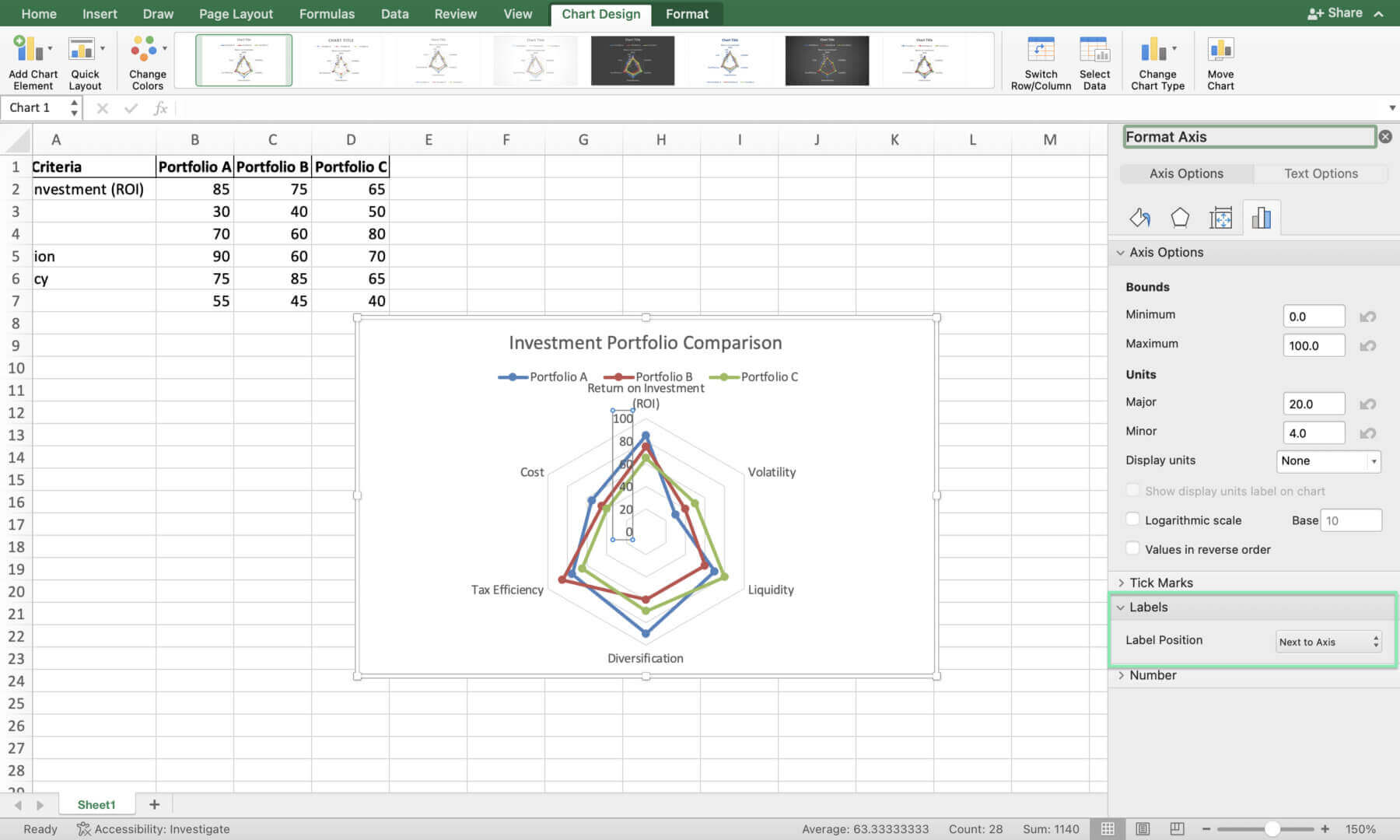
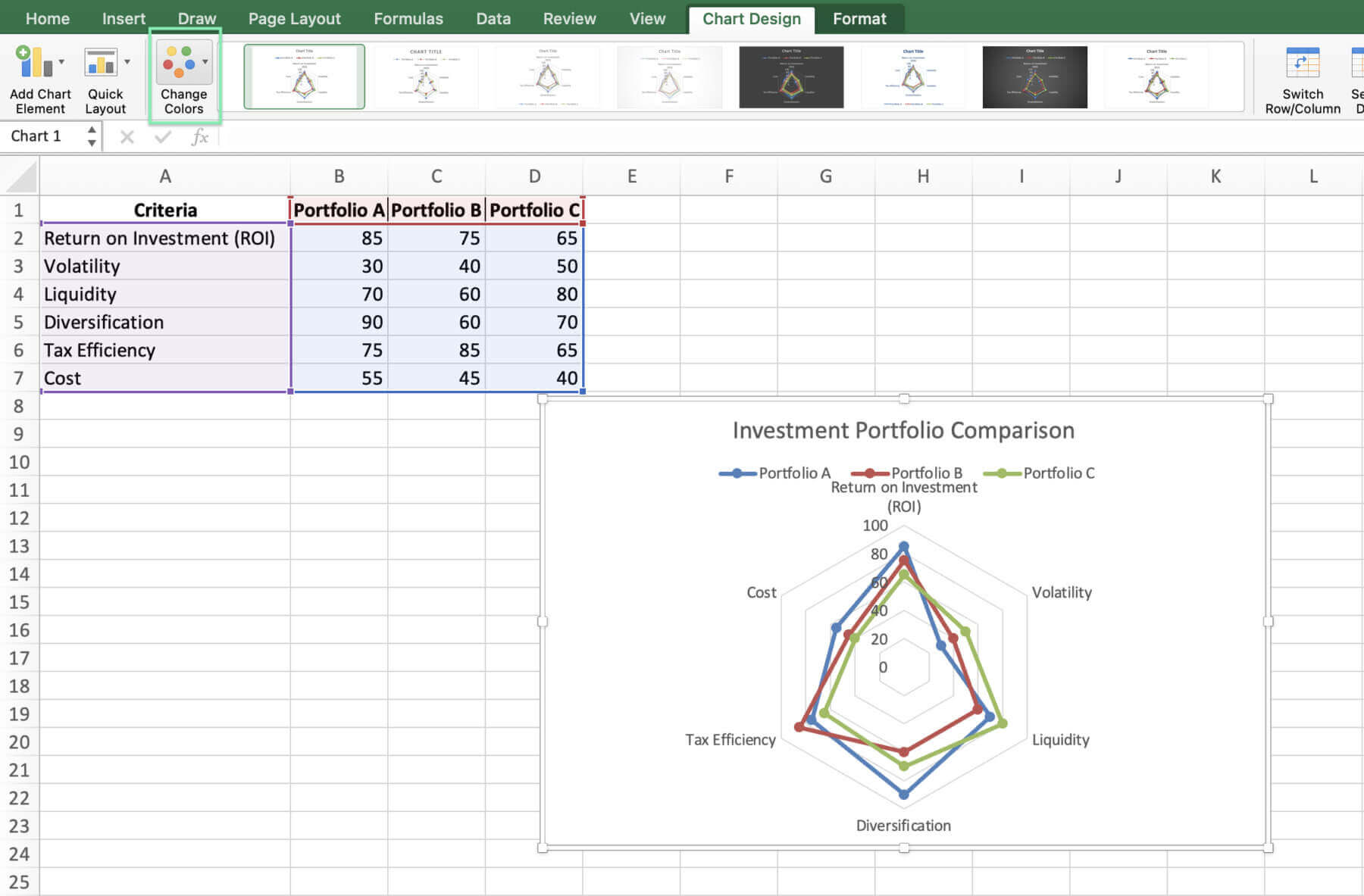
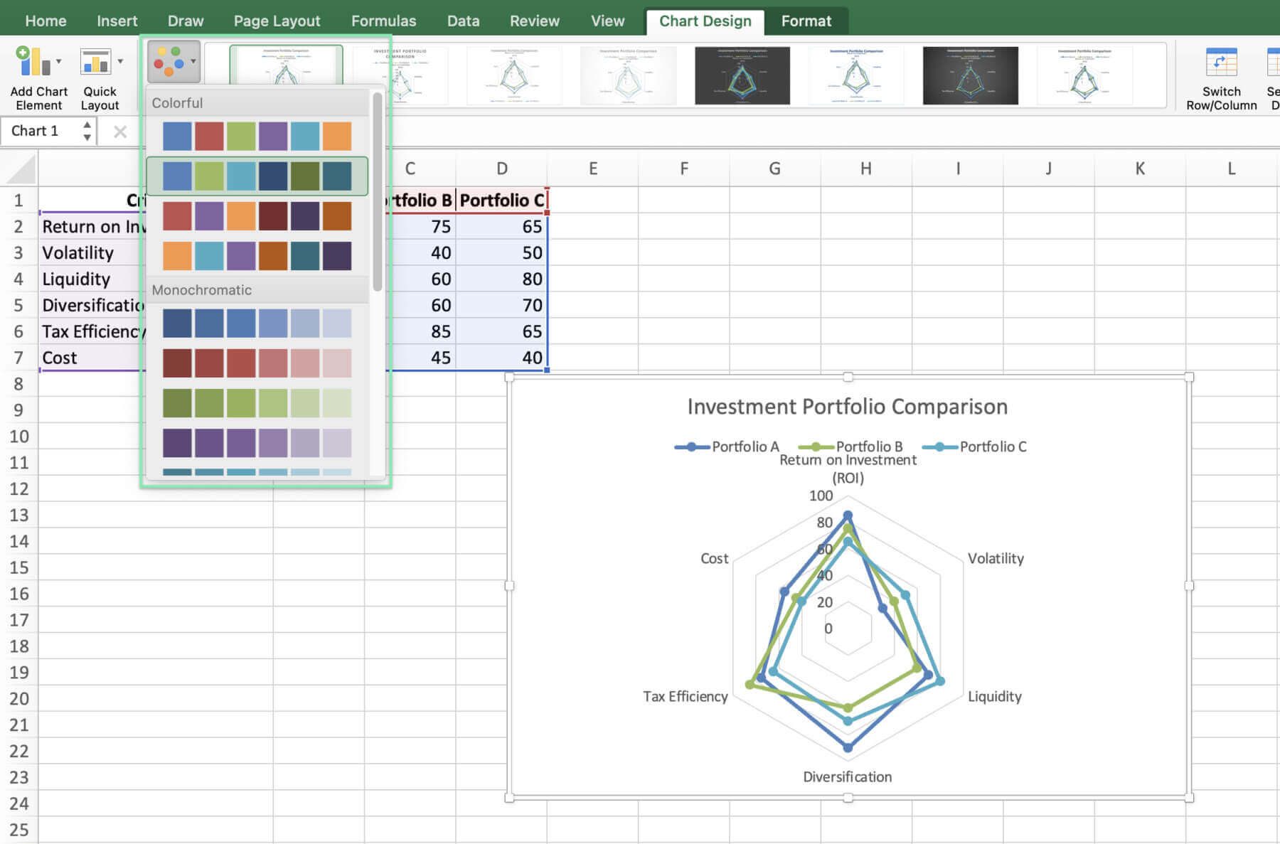
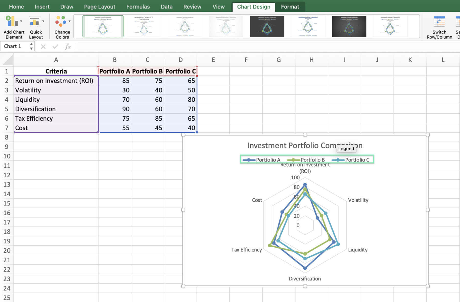
To tailor the radar chart further for professional use, consider the following advanced customizations:

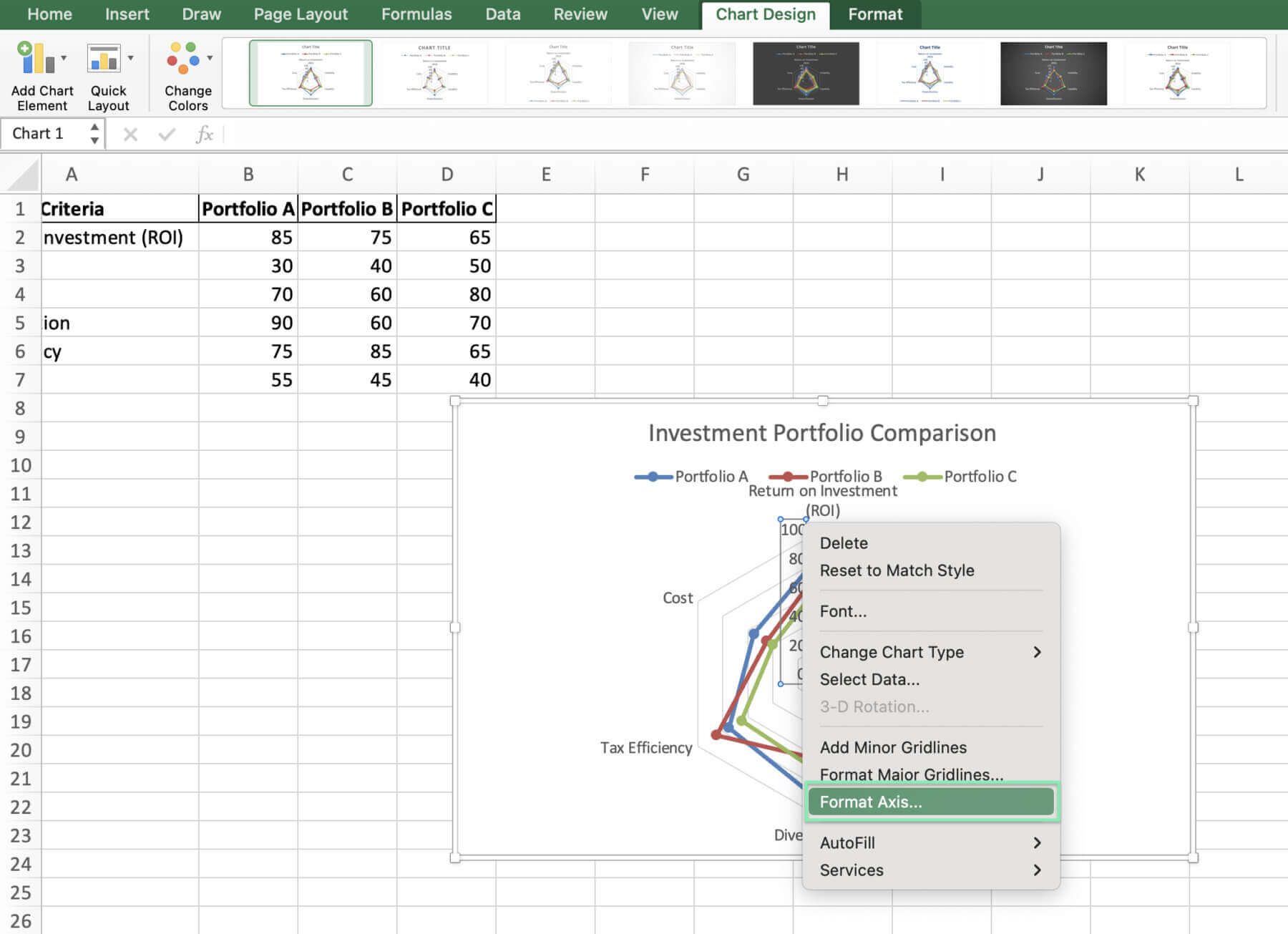
  1. Add or drop data to zoom in on comparisons.
  2. Change the scale to highlight portfolio differences.
  3. Show exact KPI values with data labels.
  4. Use colors that fit your company’s brand.
  5. Add your chart to reports for a uniform look.

Before you dash off to impress with your charts, let’s make sure you sidestep some common pitfalls.

Common Mistakes to Avoid in Financial Radar Charts

When creating radar charts for financial data, be mindful of the following common mistakes:

  1. Overcrowding the chart with too many portfolios or KPIs, which can make it difficult to interpret
  2. Using an inappropriate scale that fails to capture the differences between portfolios effectively
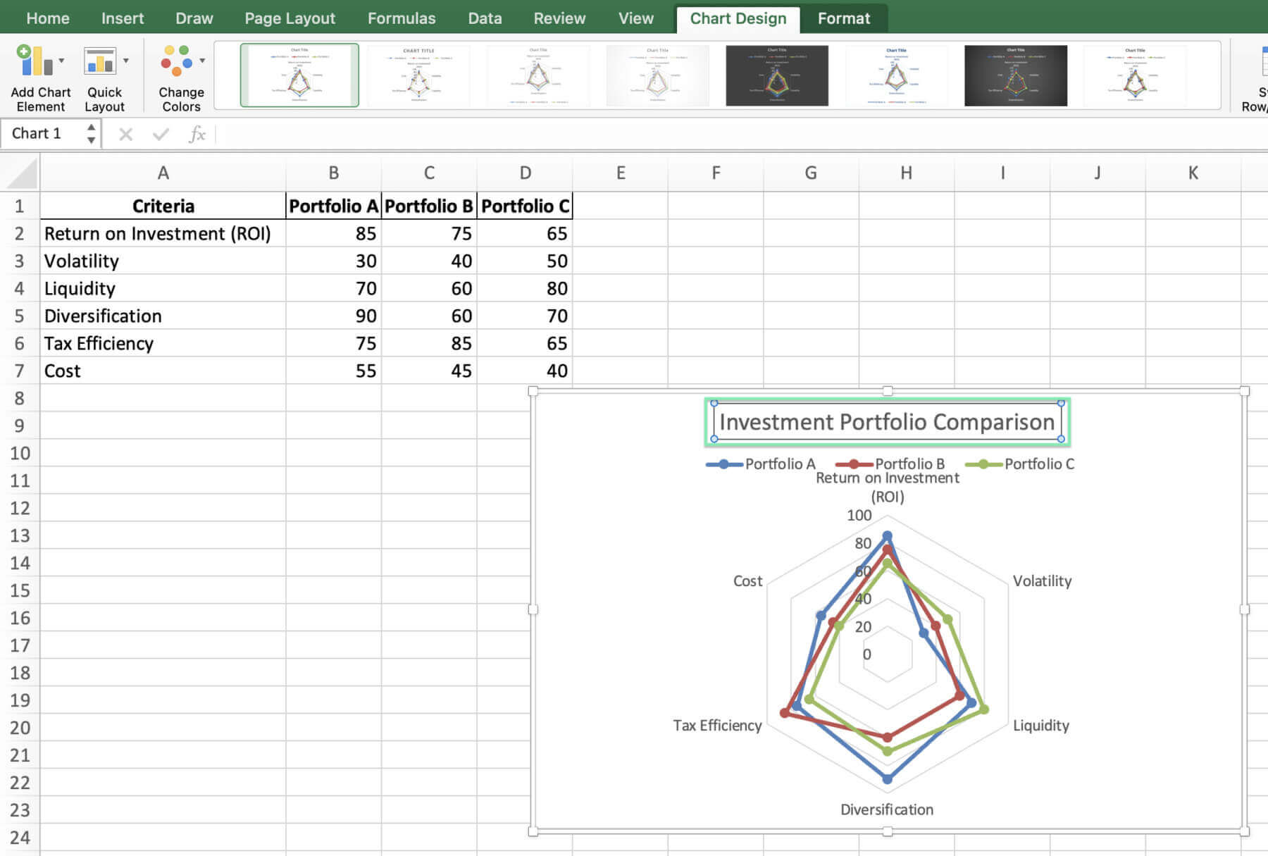
  3. Neglecting to customize the chart title, axis labels, and legend, leading to confusion
  4. Choosing colors that are not colorblind-friendly or do not maintain a professional appearance

Alright, with those traps out of the way, let’s wrap things up and get you charting your path to insight.

Using Quick Charts by Macabacus

Creating charts in Excel for finance and consulting can be complex and time-consuming. Macabacus simplifies the process with Quick Charts, allowing you to automate chart creation with just a few clicks.

Quick Charts helps streamline the chart setup, providing a preferences dialog for formatting, orientation, sizing, and labeling, which Macabacus remembers for future use. It ensures consistency and saves you valuable time.

Macabacus’ Quick Charts also offer in-worksheet options to customize your charts later, even without the add-in installed. Experience the ease and efficiency of Quick Charts by checking out Macabacus today and transform the way you create charts in Excel.

Conclusion

Now, you’re set to make charts that compare portfolios and help you decide. It’s about knowing your data, picking KPIs, and following prep and design rules. Mastering radar charts in Excel helps professionals make smarter decisions.

Try different styles to clearly share insights with others. For better charts, check advanced tools like Macabacus

Sign up for a free 14-day trial of Macabacus today and see how it can help you!

Improve your skills with what you’ve learned to make action-driving charts. New or experienced, use radar charts for better financial insights and results.

Enjoy charting!

Build Financial Models in Minutes

Enterprise-Grade Financial Modeling used by 80,000+ professionals across Investment Banking, Private Equity, and Corporate Finance. Ensure consistency, accuracy, and efficiency across your entire organization.

Discover more topics

Download The State of M&A Transactions
Download this report for expert guidance on innovative structures, cost-effective financing, and antitrust strategies to accelerate deals.
Read more
DCF Excel Template
Elevate your investment analysis with our free DCF model template. Understand discounted cash flow principles and perform accurate valuations in Excel.
Read more
Operating Model Excel Template
Download our free operating model Excel template. Forecast revenue, expenses, and key financial metrics for better decision-making.
Read more
LBO Excel Model
Try LBO modeling with our comprehensive Excel template. Understand key concepts, calculate returns, and gain actionable insights.
Read more