Advanced Tips for Effective Waterfall Charts
To make your waterfall charts more effective and informative, consider the following tips:
- Handle negative values effectively by using a different color (e.g., red) to distinguish them from positive values.
- Add subtotal columns for multi-category breakdowns to provide additional insights and context.
- Utilize color coding to enhance understanding, such as using green for increases and red for decreases.
- Incorporate interactive elements for digital presentations, such as tooltips and drill-downs, to allow users to explore the data in more detail.
Common Pitfalls and How to Avoid Them
When creating waterfall charts, be aware of the following common pitfalls:
- Mislabeling data points: Ensure that your labels accurately reflect the data being presented to avoid confusion.
- Overcomplicating the chart with too much data: Keep your waterfall chart simple and focused on the most important information to maintain clarity.
- Choosing inappropriate scales: Use scales that accurately represent the data and avoid misleading interpretations.
Illuminating Financial Insights with Waterfall Charts
For financial modeling and investment banking professionals, waterfall charts are indispensable tools that shed light on intricate data narratives. Let’s explore three scenarios where these visual powerhouses excel:
Scenario 1: Dissecting Corporate Financials
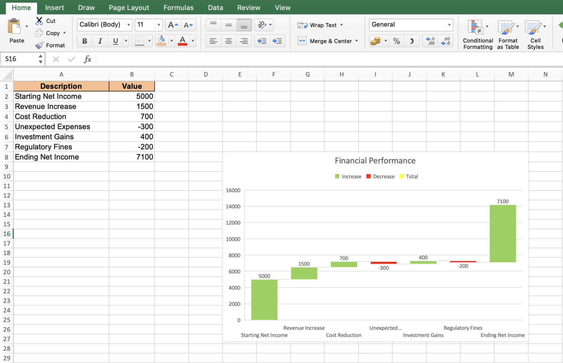
Imagine a corporation leveraging a waterfall chart to meticulously analyze its fiscal year performance. The opening bar represents the starting net profit, followed by a cascade of bars illustrating the impact of revenue drivers and cost components. The culminating bar unveils the final net profit figure, enabling stakeholders to pinpoint the critical factors influencing bottom-line health.
Scenario 2: Steering Large-Scale Projects
Envision a project finance manager navigating a multi-phase megaproject using a waterfall chart. Each phase is depicted as a bar, with completed stages in green, ongoing phases in yellow, and forthcoming milestones in gray. This comprehensive view empowers the manager and stakeholders to monitor progress, identify potential bottlenecks, and steer the project towards successful completion.
Scenario 3: Decoding Sales Dynamics
Picture a sales analytics team dissecting a year’s revenue data with a waterfall chart. The initial bar represents the starting revenue figure, followed by bars illustrating monthly fluctuations – green for increases and red for declines. The final bar consolidates the annual revenue, enabling the team to discern patterns, pinpoint seasonality, and evaluate the effectiveness of sales strategies.
Mastering Financial Visualization and Waterfall Charts with Macabacus
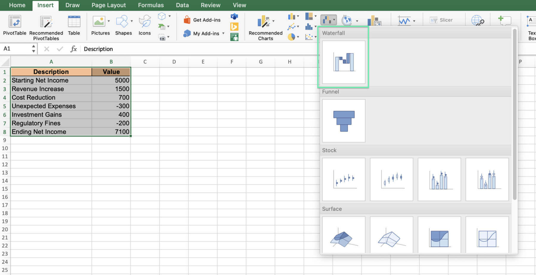
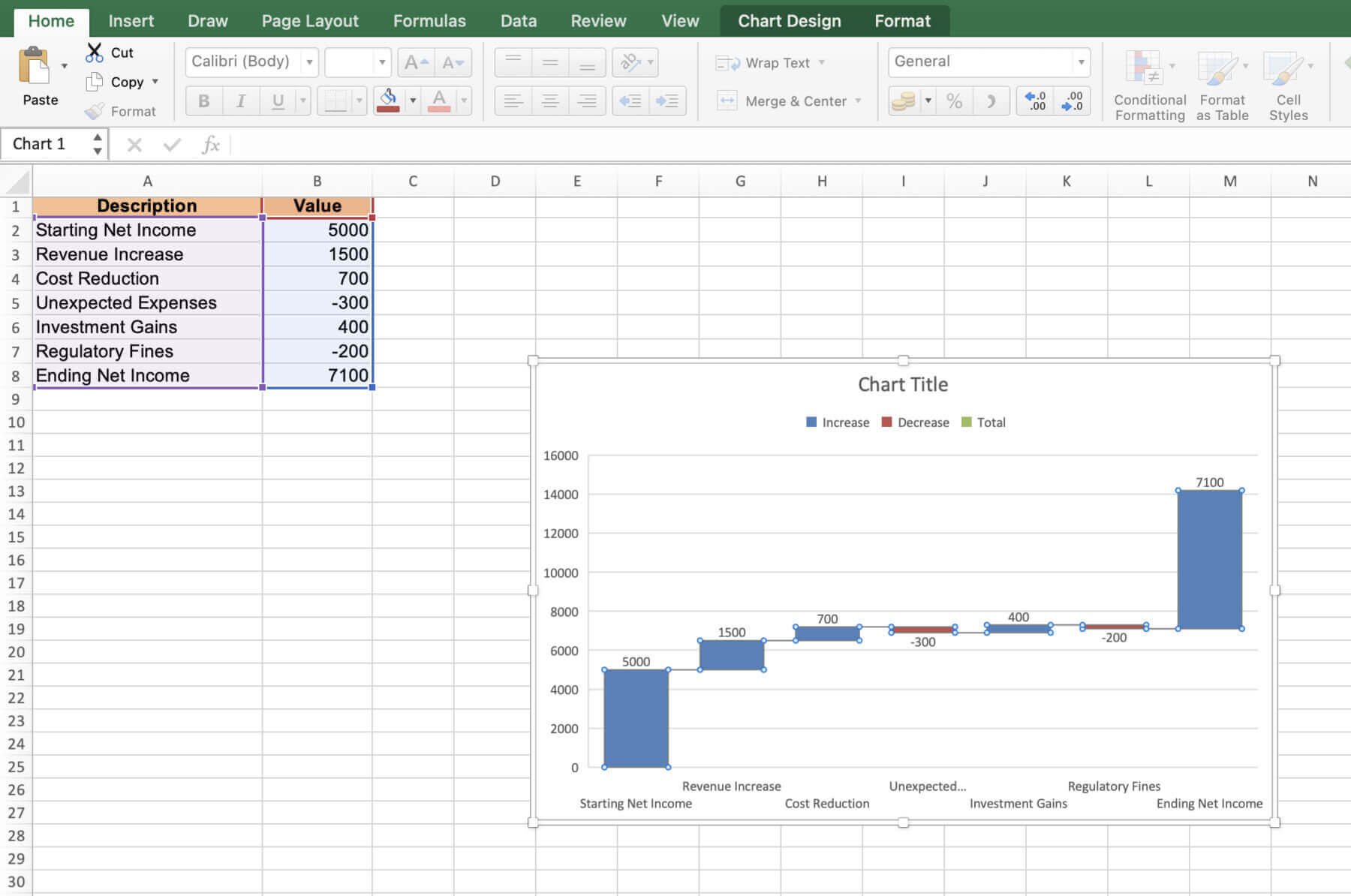
Waterfall charts are potent visualization tools that translate complex financial data into a lucid narrative. Microsoft introduced native waterfall charts in Excel 2016. The charts allow users to set individual colors and do not require additional calculations.
However, in Excel 2016, the native waterfall and other new types of charts were also buggy. They also lacked key functionalities, including the ability to export to PowerPoint or Word using add-ins such as Macabacus.
On the other hand, waterfall charts in Macabacus offer several advantages. They include being able to create an intuitive data structure without the need to identify totals, remember the last used colors and settings, and use better-looking, formatable connector lines.
Waterfall Charts From Start to Finish
Waterfall charts are a valuable data visualization tool for presenting complex data in a clear and concise manner. By breaking down the process of creating waterfall charts into simple steps and providing real-world examples, this blog post has equipped you with the knowledge and skills needed to create effective waterfall charts for your own data analysis projects.
Remember to keep your charts simple, accurate, and visually appealing to ensure your message is effectively communicated to your audience. With practice and by using Macabacus, you’ll soon become a master of waterfall charts and unlock new insights from your data.