
Smart investment choices are essential in finance. Risk-return analysis is crucial. It helps finance professionals weigh the risks and rewards of different investments. X Y ‘Scatter’ charts make decision-making easier by showing risk-return clearly.
Smart investment choices are essential in finance. Risk-return analysis is crucial. It helps finance professionals weigh the risks and rewards of different investments. X Y ‘Scatter’ charts make decision-making easier by showing risk-return clearly.
TABLE OF CONTENTS
Financial analysts love using X Y ‘Scatter’ charts. They make spotting patterns, trends, and outliers easy. They plot risk against ROI for assets in finance. They help pros quickly get the risk-return scoop, aiding smart decisions.
Now that you’ve grasped the importance of X Y charts in finance, let’s dive into how you can prepare your own financial data.
Enterprise-Grade Financial Modeling used by 80,000+ professionals across Investment Banking, Private Equity, and Corporate Finance. Ensure consistency, accuracy, and efficiency across your entire organization.
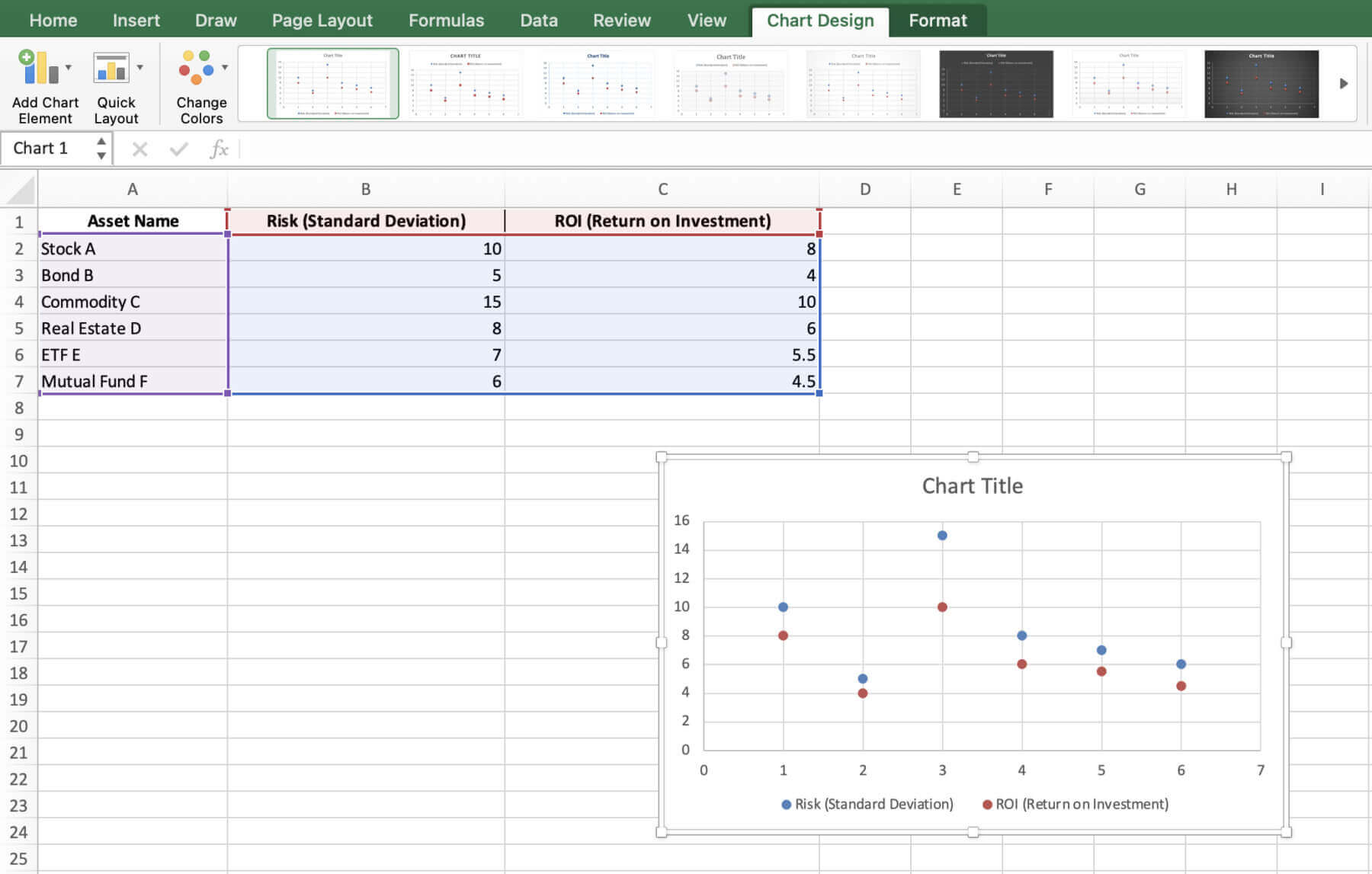
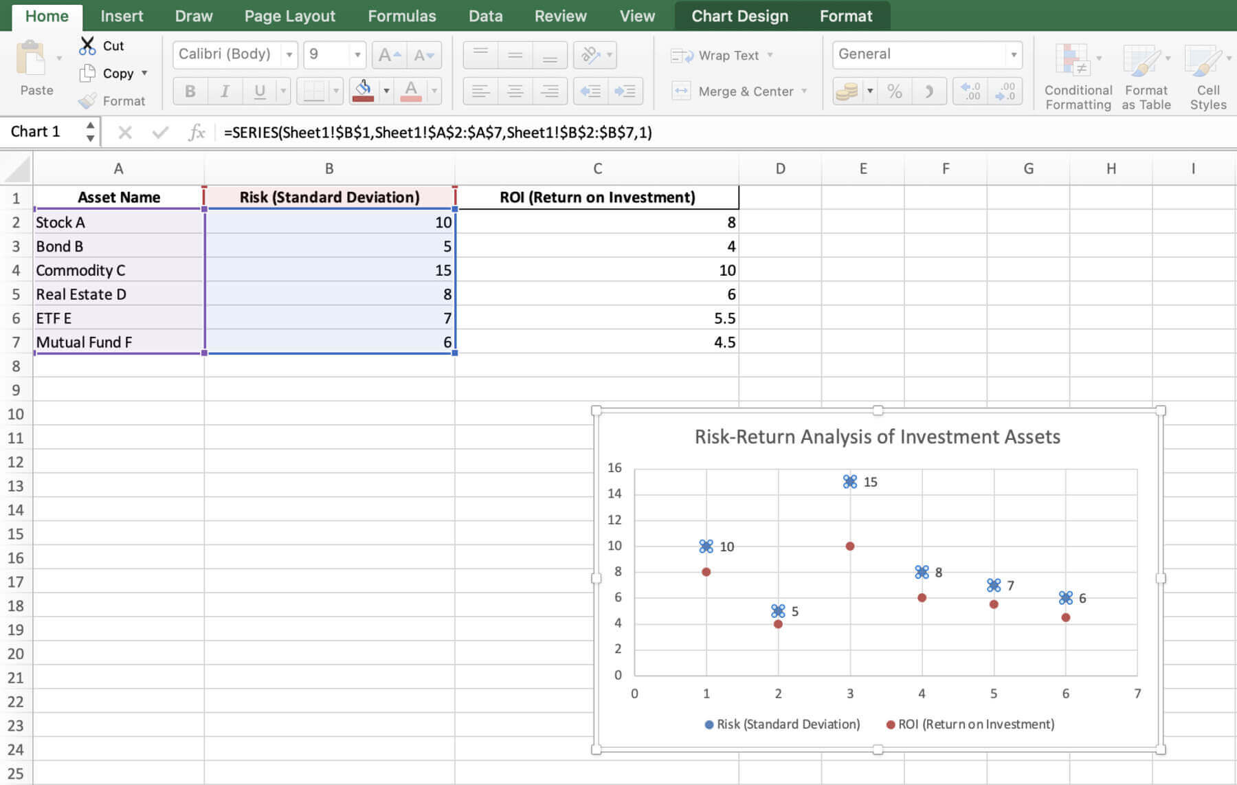
Get your financial data ready for easy viewing before making an X Y ‘Scatter’ chart. Begin with your data in a table, including columns for analysis factors. We’ll check out risk and ROI for six assets: Stocks, Bonds, Commodities, Real Estate, ETFs, and Mutual Funds. Keep your data tidy and mistake-free.
Alright, got your data all tidied up? Let’s roll up our sleeves and get to charting!

Try Macabacus for free to accelerate financial modeling in Excel.
Below is a step-by-guide that you can follow when creating an X Y chart:
Open Excel and add your data.

After adding the data, highlight it all, like A1 to C7.

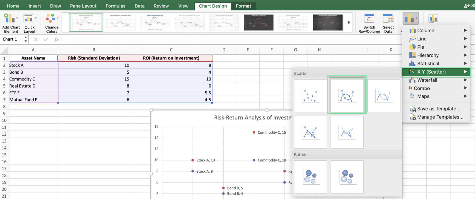
Click Insert in Excel, find ‘X Y (Scatter) Chart’, and select it.


You will have a basic X Y (Scatter) chart.
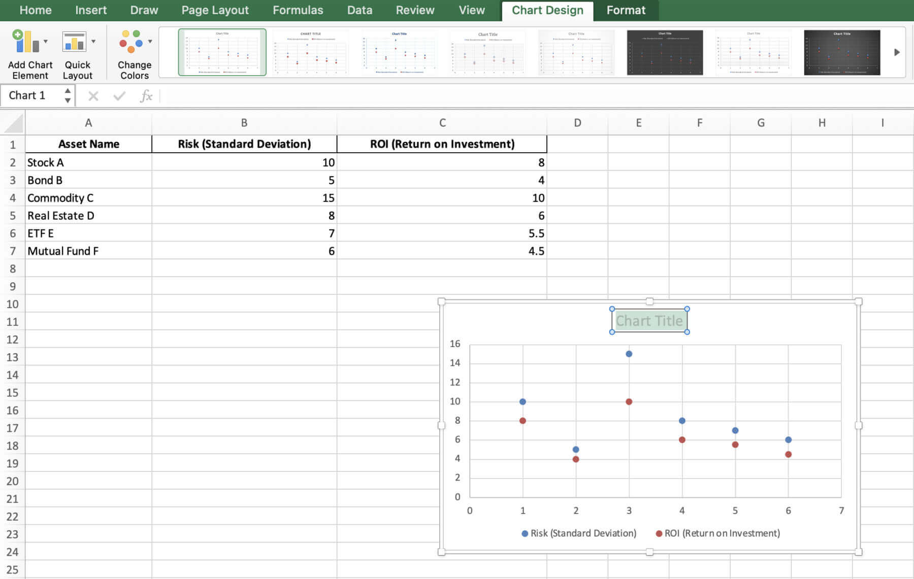
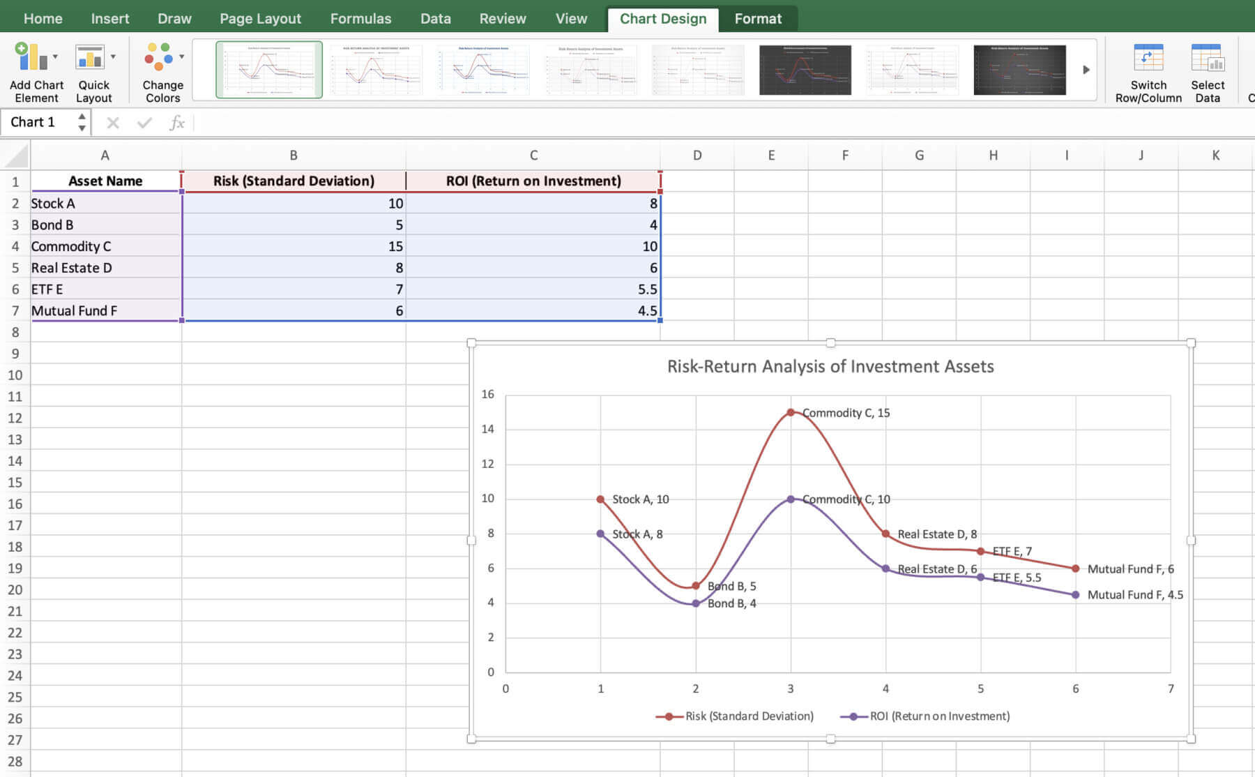
Got a basic chart? Let’s tweak it. Start with the chart title. Then, label the x and y axes. Update labels to show asset names.
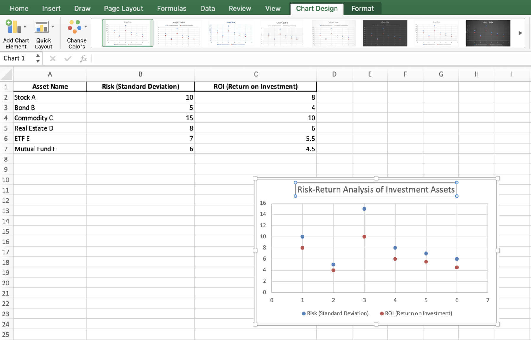
Title: To give your chart a new name, click ‘Chart Title’ and type your preferred name.
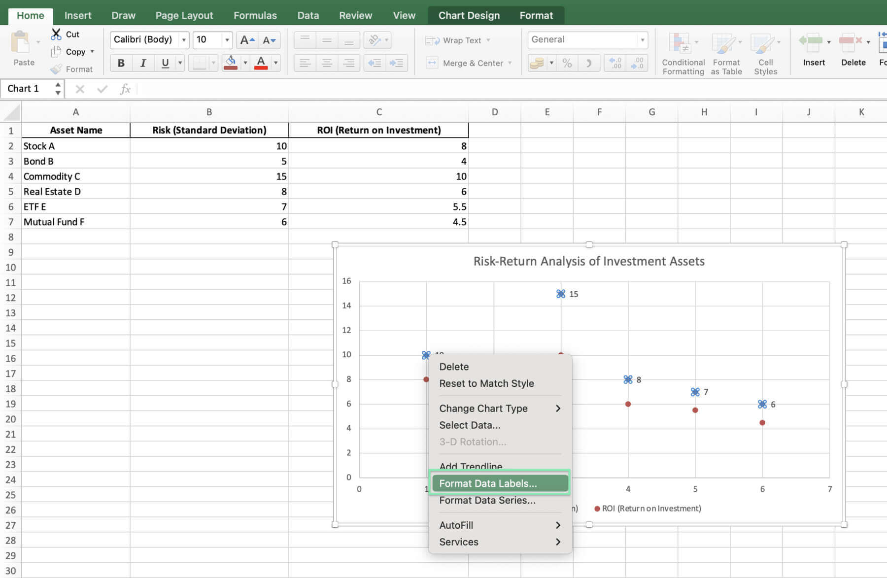
Data Labels: Right-click on the chart data, and choose ‘Add Data Labels’.
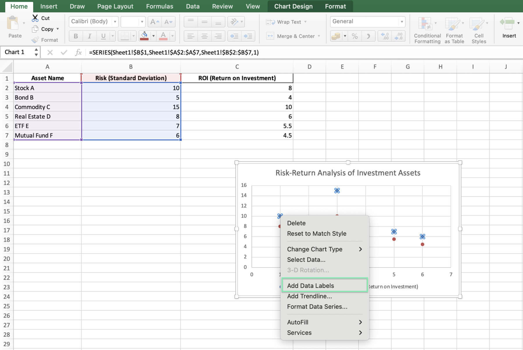
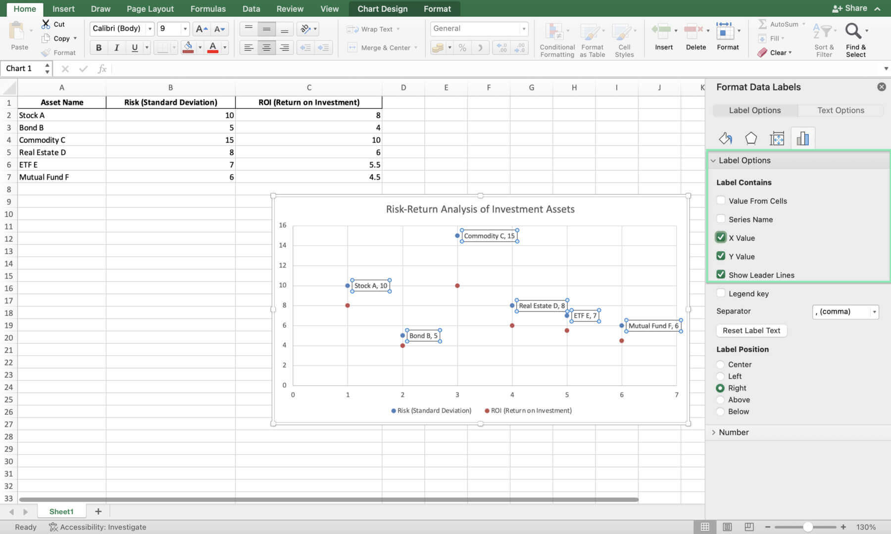
To change labels, right-click and select ‘Format Data Labels’.
From the label options, check the ‘X Value’ box to display the names of the assets.
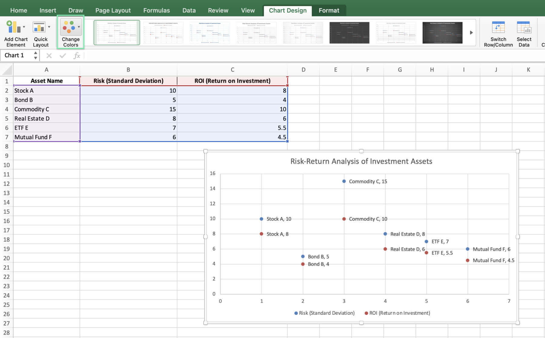
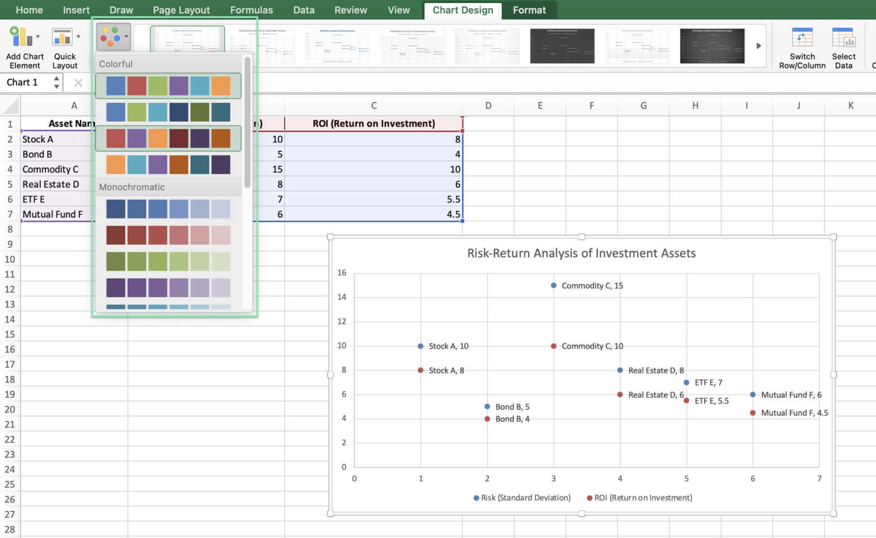
Color: Change colors to differentiate and make the chart look sharp. To change it, select the chart and click the ‘Change Colors’ dropdown menu. Select one among the Colorful options.
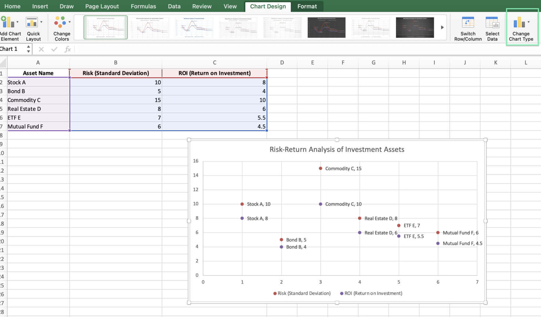
Type: To change the chart type, click the chart and select ‘Change Chart Type’. Then, choose ‘X Y Scatter’ and select from the available options.
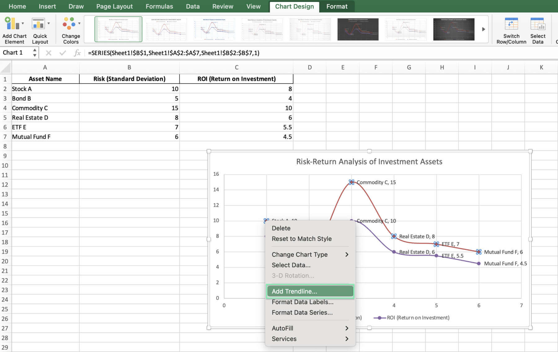
Trend Lines: Add trend lines to the forecast for a more professional look. Just right-click on any data point in the chart, select ‘Add Trendline’, and pick the right trend line type. This allows you to better understand the patterns in the data and make informed forecasts about future performance.
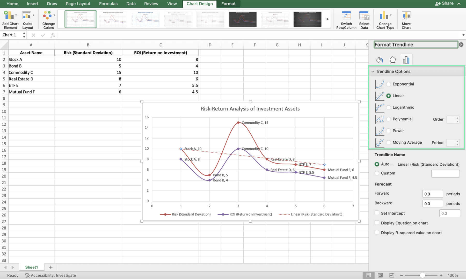
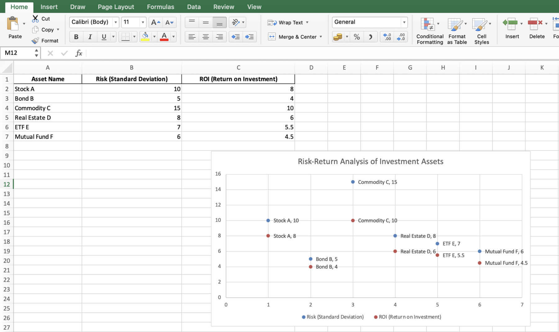
Here’s a look at the final version of the X Y chart.

Try Macabacus for free to accelerate financial modeling in Excel.
Let’s dive into your X Y ‘Scatter’ chart to make smart moves. The chart clearly shows each asset’s risk vs. reward. Higher up means more return; righter means more risk.
Investors want the most return for the least risk. Stock A gives more but is riskier; Bond B is safer but pays less. Check their spots on the chart to pick what fits your goals and risk comfort.
Feeling like a financial whiz yet? Hold on because we’re about to kick it up a notch.
Excel offers lots of powerful tools for better financial analysis. For example, the Data Analysis Toolpak lets you do complex stats like regression. They show deep insights into risk and return for different assets.
Another excellent tool is ‘What-If Analysis,’ which lets you test different scenarios. This helps when checking possible outcomes of investment strategies.
Before you run off to create your masterful charts, let’s pump the brakes and cover some common slip-ups to avoid.
When making X Y ‘Scatter’ charts, watch out for the following traps:
Alright, we’ve covered a lot of ground. Ready to wrap this up and send you on your way to charting stardom?
Many users find creating charts in Excel complex and time-consuming, especially for those working in finance and consulting. The Quick Charts feature from Macabacus helps simplify the chart creation process, automating the process with just a few mouse clicks.
When using Macabacus to create a new Quick Chart, a preferences dialog lets you set options for labeling, orientation, sizing, and formatting, which the add-in remembers for future use. Additionally, most Quick Charts come with in-worksheet options for later customization, even if Macabacus is not installed.
Experience the ease and efficiency of Quick Charts by checking out Macabacus today. Automate your chart creation process, save valuable time, and ensure consistency in your presentations and reports.
You’re set to make killer X Y charts to nail risk-return profiles, helping you decide better. Just remember, know your financial data well, pick the right risk and return measures, and stick to the basics of preparing data and designing charts. Get good at making X Y charts in Excel, and you’ll wow your colleagues and clients with smart investment choices.
Go ahead and play with chart customizations to share your insights best. Want to level up your charting skills? Give Macabacus a shot. It streamlines making and reading X Y charts, freeing you up to make smarter investment calls.
Seasoned or new in finance, keep sharpening your skills and use what you’ve learned from this guide. This way, you’ll make impactful X Y charts that offer key financial insights for smarter investment choices.
Happy charting!
Enterprise-Grade Financial Modeling used by 80,000+ professionals across Investment Banking, Private Equity, and Corporate Finance. Ensure consistency, accuracy, and efficiency across your entire organization.