Bar Charts
Bar charts are excellent for comparing values across different categories. Such a capability makes it easy to assess relative magnitudes at a glance.
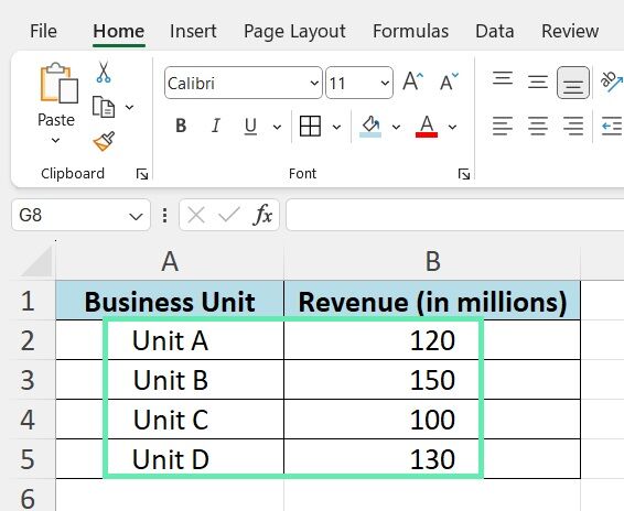
Investment bankers often use bar charts to compare financial metrics across different business segments, such as revenues or expenses by unit, product line, region, or department. For instance, a dataset can illustrate a company’s revenue breakdown by business unit.

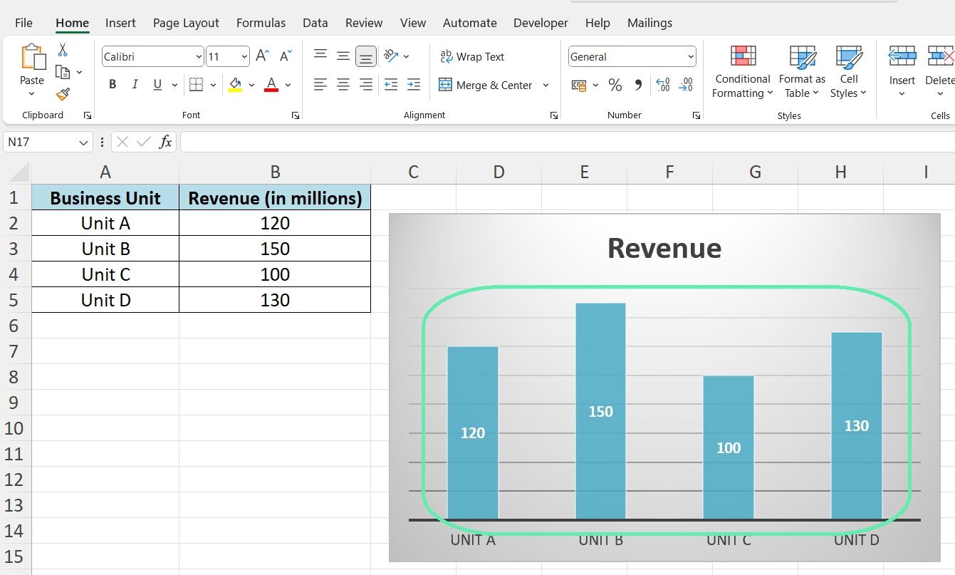
After importing the data into Excel, creating a bar chart is the most effective way to visualize it. The business units serve as labels on the horizontal axis, with revenue values represented by the heights of the bars. It allows for easy ranking of units by revenue. Unit B leads at $150M, Unit D at $130M, Unit A at $120M, and Unit C at $100M.

Bar charts are essential for comparing financial data across categorical variables. Investment bankers commonly use them for clear and impactful data analysis and presentations.
Pie Charts
Pie charts visually represent how different parts contribute to a whole. The circle is divided into slices, with each slice’s size reflecting the proportion of each category’s fraction of the whole.
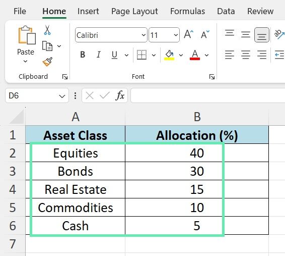
In investment banking, pie charts are commonly used to break down data like capital allocation or market share. They can illustrate the allocation of a portfolio within an investment fund using a given dataset.

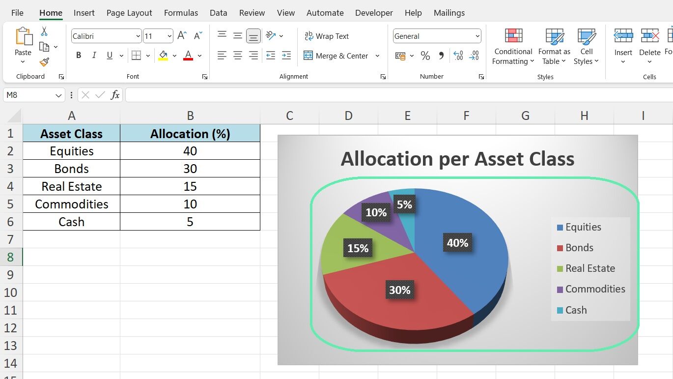
The fund’s allocation strategy is immediately apparent after importing the data into Excel and creating a pie chart. Equities represent 40%, bonds 30%, real estate 15%, commodities 10%, and cash 5%.

The pie chart clearly shows the fund’s capital distribution, allowing for a quick assessment of each asset class’s importance. It makes pie charts useful for understanding compositional data at a glance, whether it’s portfolio allocation, revenue mix, market share breakdown, or any other dataset.
Scatter Plots
For visualizing the relationship between two variables, scatter plots are the tool of choice. In a scatter plot, each data point is plotted individually on a two-dimensional graph, with its position determined by its X and Y values. The overall pattern of the points can reveal if the variables are correlated and, if so, the nature and strength of the relationship.
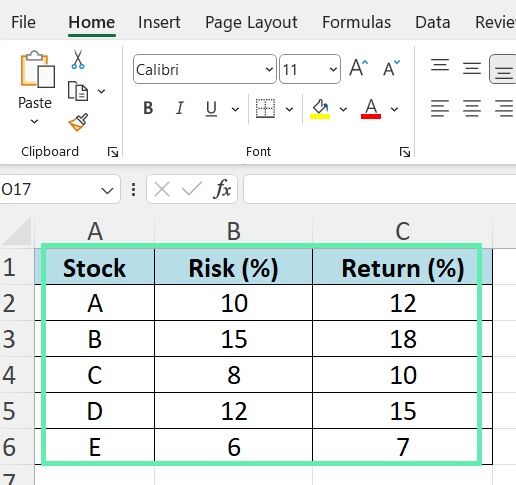
Investment bankers frequently use scatter plots for evaluating and communicating relationships between financial variables. A prime example is analyzing the risk-return tradeoff of potential investments. Consider the following dataset:

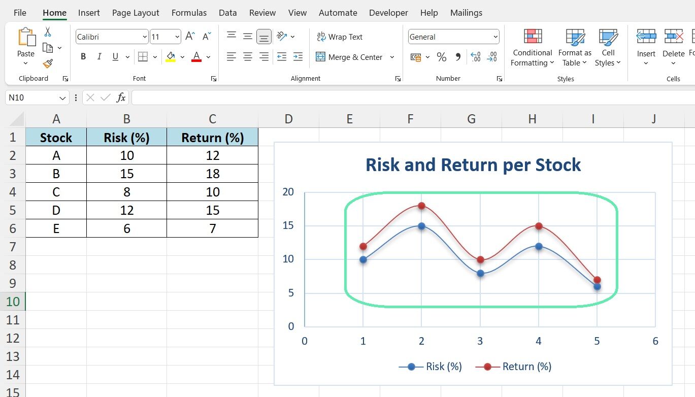
Import the above data into Excel and create a scatter plot. Put risk percentages on the X-axis and returns on the Y-axis. Each stock becomes a point on the chart.

The scatter plot shows a positive correlation. Higher risk (right) usually means higher returns (up). Stock B shows the highest risk and return, while Stock E shows the lowest. The others are in between.
Scatter plots help understand variable relationships quickly. They show if variables are positively, negatively, or not correlated. They reveal if the relationship is strong or weak, linear or nonlinear. For investment bankers, scatter plots are vital for evaluating opportunities, identifying risks, and explaining relationships to clients.
Histograms
When we deal with massive datasets, comprehending the distribution of values is typically vital. It is the specialty of histograms. In a histogram, the entire range of values in the dataset is split into numerous intervals known as ‘bins’. The height of each bar on the histogram directly corresponds with the number of data points contained in the respective interval. Consequently, we can see how data is distributed by presenting it graphically through a histogram.
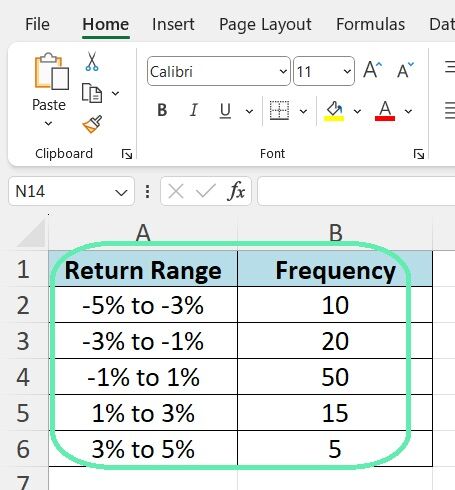
Histograms are often used for various purposes in the context of investment banking. They include analyzing the distribution of market returns, examining the frequency distribution among diverse transaction sizes, and discovering the composition of a portfolio in data technology, among others. An illustration of daily stock returns through a hypothetical set is presented below:

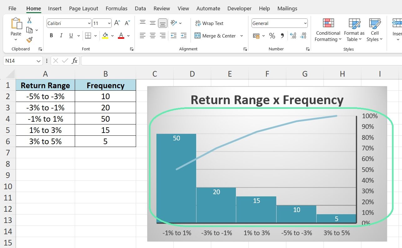
After loading the above frequency distribution data into Excel, a histogram is a natural visualization choice. The return intervals (the ‘bins’) are laid out from left to right on the X-axis, and the height of each bar represents the number of data points (the ‘frequency’) falling into the said bin.
The resulting histogram provides an instant visual summary of how the returns are distributed. It follows a roughly bell-shaped distribution, with most returns falling in the -1% to 1% range and fewer occurrences as we move out into the tails.

The above illustrates the value of histograms for quickly grasping the shape of a dataset’s distribution. Are the values uniformly distributed or clustered around specific modes? Is the distribution symmetrical or skewed? Does it show fat tails or thin tails?
The visual nature of a histogram makes such characteristics apparent immediately. For an investment banker, the instant insight into distributional properties is invaluable for understanding risk, evaluating opportunities, and making data-driven decisions.
Area Charts
When you need to visualize how a total quantity changes over time, with the ability to break down the changes by category, area charts are an excellent choice. Like a line chart, an area chart displays values over a continuous range but with the area between the axis and the line filled with color. When you have multiple categories, each location is stacked on top of each other. The relative size of each area shows the contribution from a specific category, while the total height represents the cumulative total across categories.
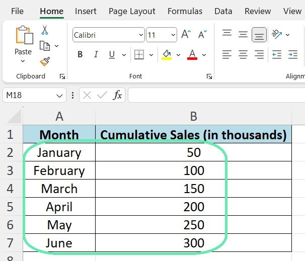
Investment bankers often turn to area charts for things like visualizing revenue growth by segment, tracking net asset value components of a fund over time, or showing how different cost categories contribute to total expense over a period. Here’s an example of using a dataset of a company’s cumulative sales throughout a year:

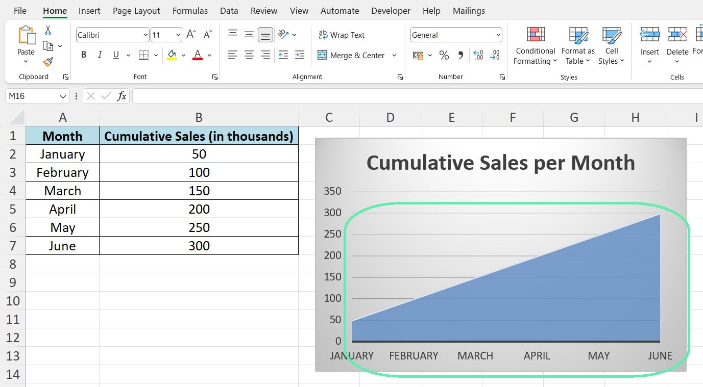
To visualize the above data as an area chart in Excel, months go on the X-axis and the cumulative sales values on the Y-axis. The chart then fills the area under the total sales line.
The resulting visual makes the growth trajectory clear at a glance. Sales start at $50K in January and grow by roughly $50K monthly, reaching $300K by June. The steady upward slope of the total area communicates consistent, linear growth.

The above example illustrates how effective area charts can be for understanding changes in a total quantity over time. More advanced examples might break the total down by product line, region, or another category through stacking. The power to simultaneously display overall trajectory and category composition makes area charts an essential tool for investment bankers analyzing time series data.
Waterfall Charts
Waterfall charts are an incredibly useful tool for drilling down into the components of a net change in value. Also known as a bridge chart, a waterfall graph shows a starting value and then sequentially introduces positive or negative changes until arriving at the ending value. Visually, it appears as if the starting value is a water source flowing over a series of rises and falls, giving the chart its name.
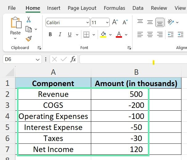
Investment bankers frequently employ waterfall charts for things like visualizing financial statement flows, analyzing deal accretion/dilution, or showing how different factors contribute to a net change in price or valuation. Here’s an example breaking down the components of a company’s net income:

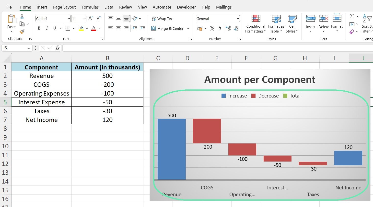
To build a waterfall chart from the above data in Excel, we start with a bar representing the $500K revenue. Then, each subsequent bar begins where the previous one left off but changes direction for a negative value. So, COGS is a downward bar to $300K, OpEx takes it down further to $200K, and so on until we reach the $120K net income bar.

The resulting visual provides a clear, logical flow from the top-line revenue to the bottom-line earnings. The increases and decreases from each line item are displayed, providing an intuitive view of each factor’s impact. We can see that COGS is the most significant expense at $200K, followed by OpEx at $100K. Interest and taxes show less impact at $50K and $30K, respectively.
Such a type of intuitive visual story is what makes waterfall charts so powerful. Being able to quickly grasp the overall change and the specific positive and negative components driving that change is immensely valuable for investment bankers. Whether analyzing a company’s earnings, dissecting deal value, or explaining valuation changes to a client, waterfall charts are an essential part of an investment banker’s visual toolbox.
Download Excel Template


