Advanced Excel Skills
While a basic area chart can provide useful insights into financial data, Excel offers many advanced methods that can help you take your data visualization abilities higher.
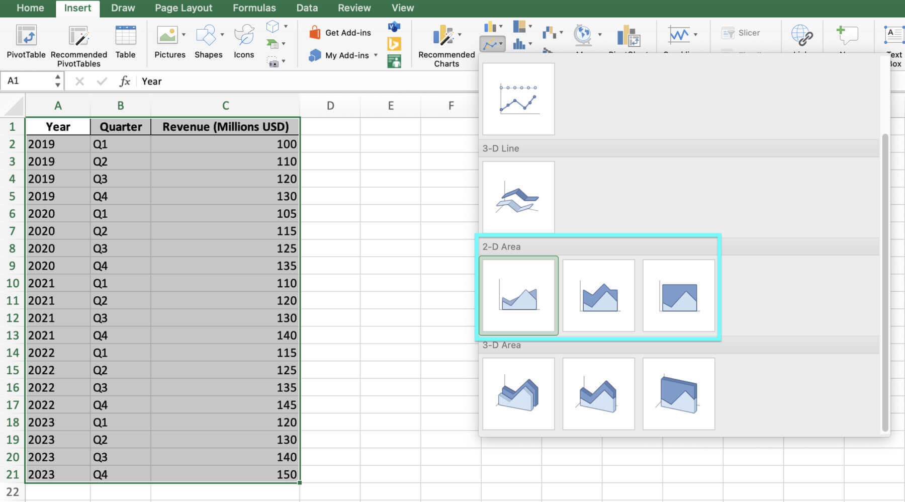
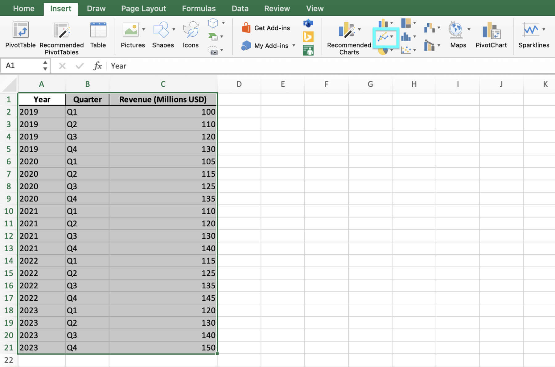
One such method is using stacked area graphs. Stacked area graphs are like regular area graphs but let you compare multiple data series (e.g., different revenue sources or investment portfolios) in a single picture. To create a stacked area chart in Excel, simply choose the “Stacked Area” option from the “Insert Area or Line Graph” dropdown menu.
But hey, let’s not stop there – once you’ve got your stacked area chart up, there’s even more we can do to jazz it up with Excel’s handy features.
Another way to make financial charts in Excel more helpful is by using things that interact and change how they look based on rules. Interactive charts let users look closer at specific numbers or filter the data based on what they choose, making complex financial information easier to explore and understand. Conditional formatting allows users to highlight certain numbers or ranges if they meet set rules (e.g., making cells brighter if they have values above or below a certain amount), which can help draw attention to key things or unusual numbers in the data.
Finally, finance workers can save time and make their work easier by learning Excel shortcuts and other tips. Some useful shortcuts for working with charts in Excel include changing how they look quickly or viewing different parts of big charts.
- Press Alt and F1 together to create a chart from selected data
- Press Ctrl and Page Down / Up together to move between sheets in a workbook
- Press Ctrl and Arrow Keys together to move to the edge of the current data area
- Press Ctrl, Shift, and the Right Arrow Key together to select all cells within the current row, up to the last used cell
- Press Ctrl, Shift, and the Down Arrow Key together to select all cells within the current column, up to the last used cell
Using these advanced methods and shortcuts, finance professionals can make more complex and helpful charts and work more easily with financial data in Excel.
Alright, you’ve got the tech know-how down pat, but making it sparkle is all in the design – let’s make sure your area chart doesn’t just function well but looks the part too.
Best Practices in Financial Chart Design
Making a clear financial chart in Excel is important to share key ideas. Here are some good tips:
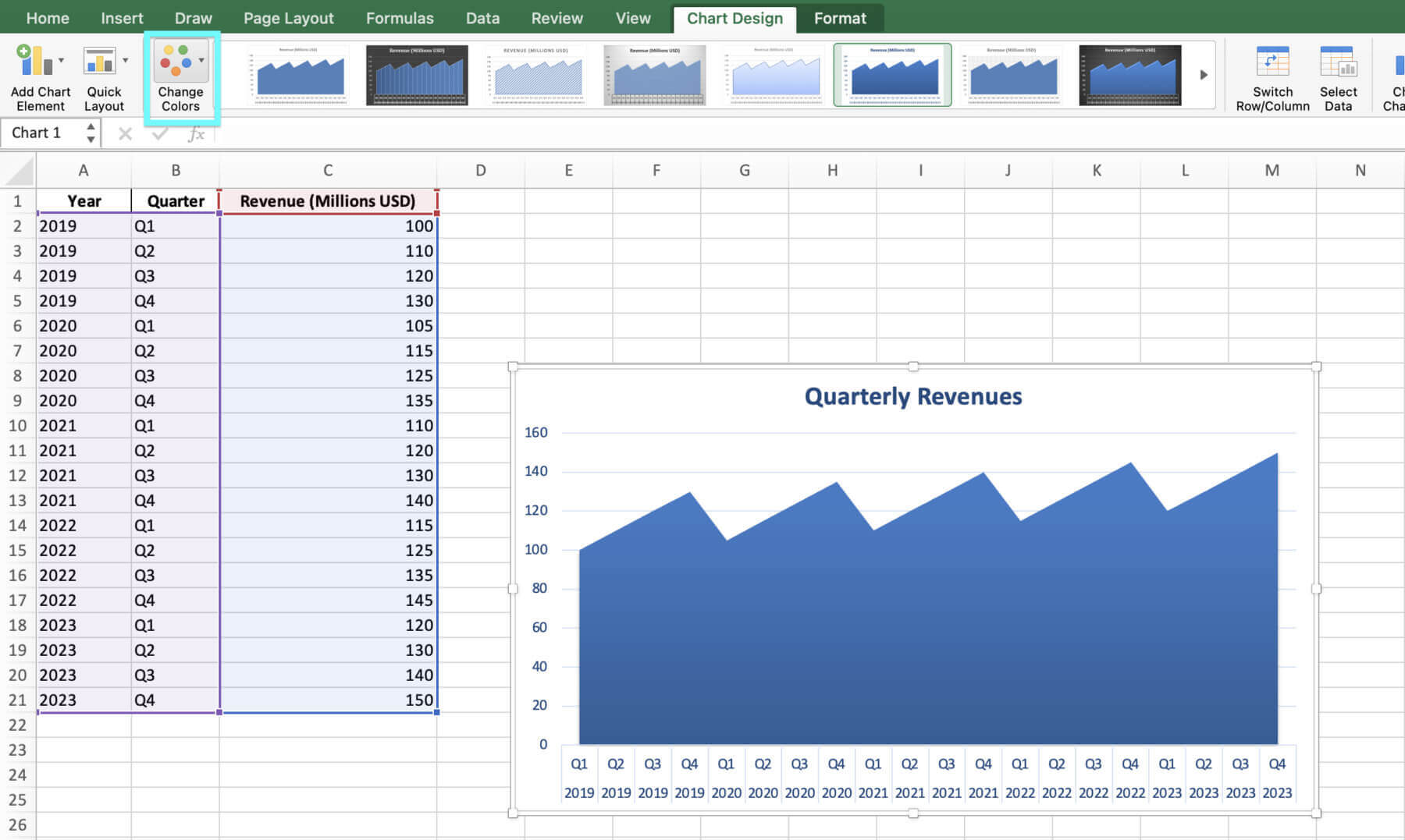
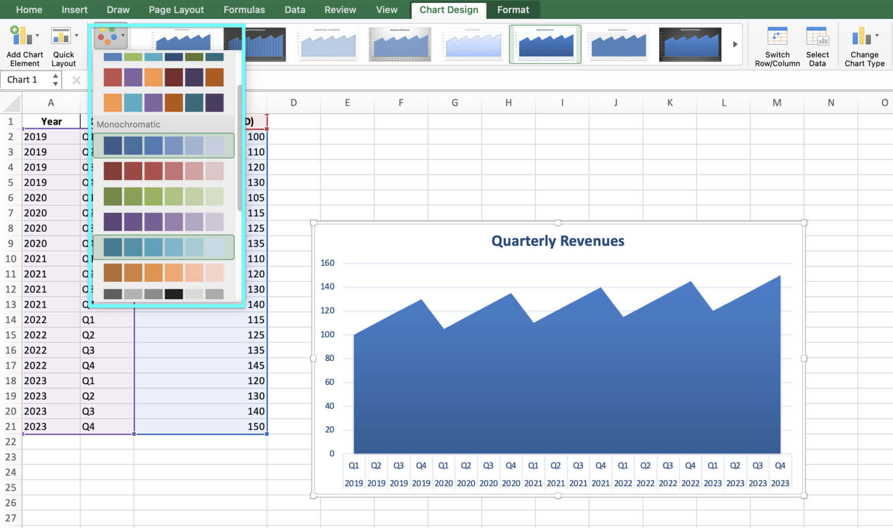
- Choose colors that are easy to tell apart. Use a color theme from your brand or the mood of the talk.
- Use simple and direct labels for the title, sides, and legend.
- Keep the chart neat without extra lines or borders that don’t help.
- Make sure the side showing money moves at the right pace for the numbers shown. Don’t make changes look bigger or smaller than they are.
- Give context for the numbers like averages for the industry or past results. This helps people understand the chart better.
Got the design cues locked in? Sweet. Now let’s move from theory to practice with a real-world dive into how these charts work magic on actual data.
Beside following design best practices, it’s crucial to stay away from regular mistakes in monetary information visualization. For example:
- Disregarding the more extensive business sector setting or monetary conditions that may be affecting the information.
- Neglecting to adjust for expansion or different variables that can twist the information after some time.
- Picking and picking information focuses or timeframes to help a specific story or schedule.
- Utilizing improper or tricking graph sorts (for example, utilizing a pie graph to demonstrate changes throughout the long term).
Following these tips and avoiding mistakes means finance pros can make appealing, insightful area charts for their audience.
Looking at Income Patterns with Area Charts
Area charts can help in financial analysis.
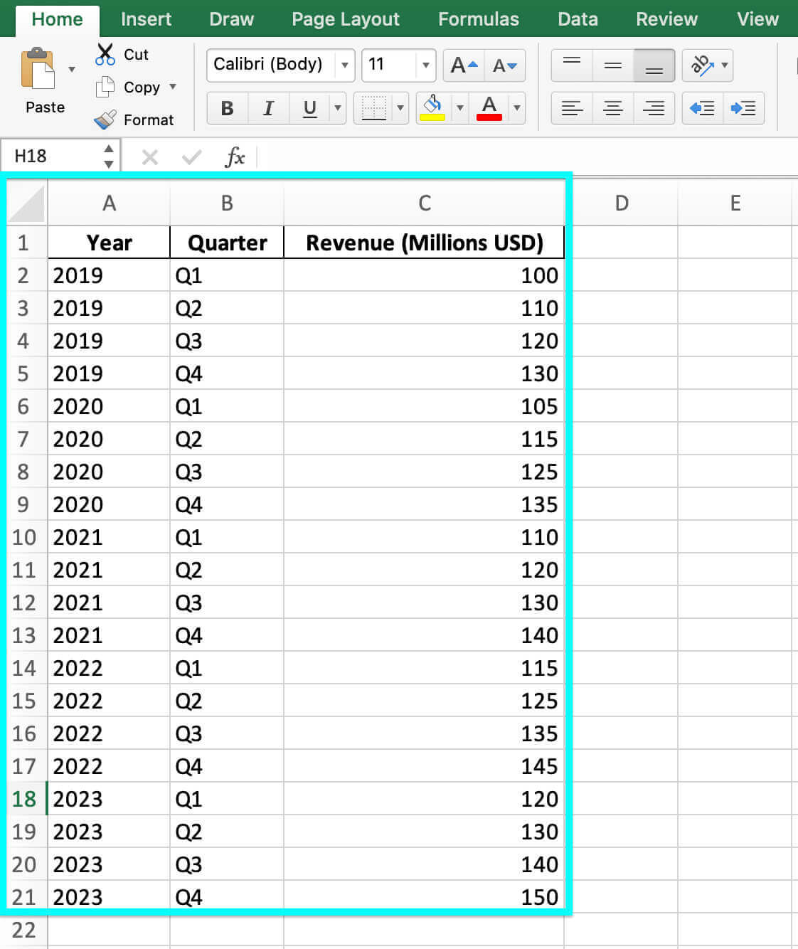
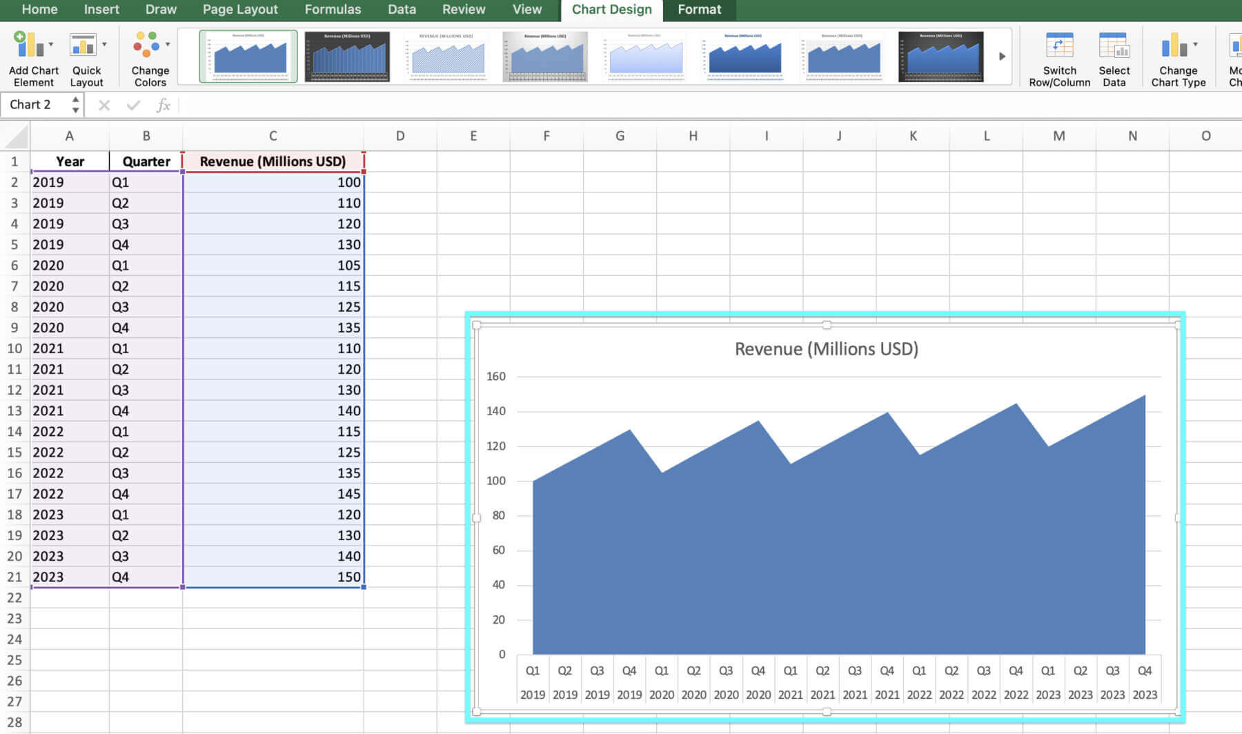
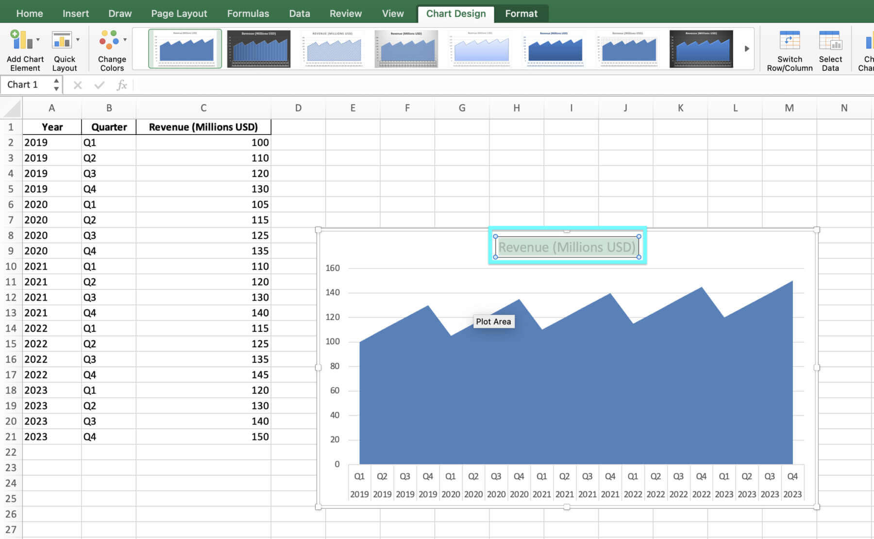
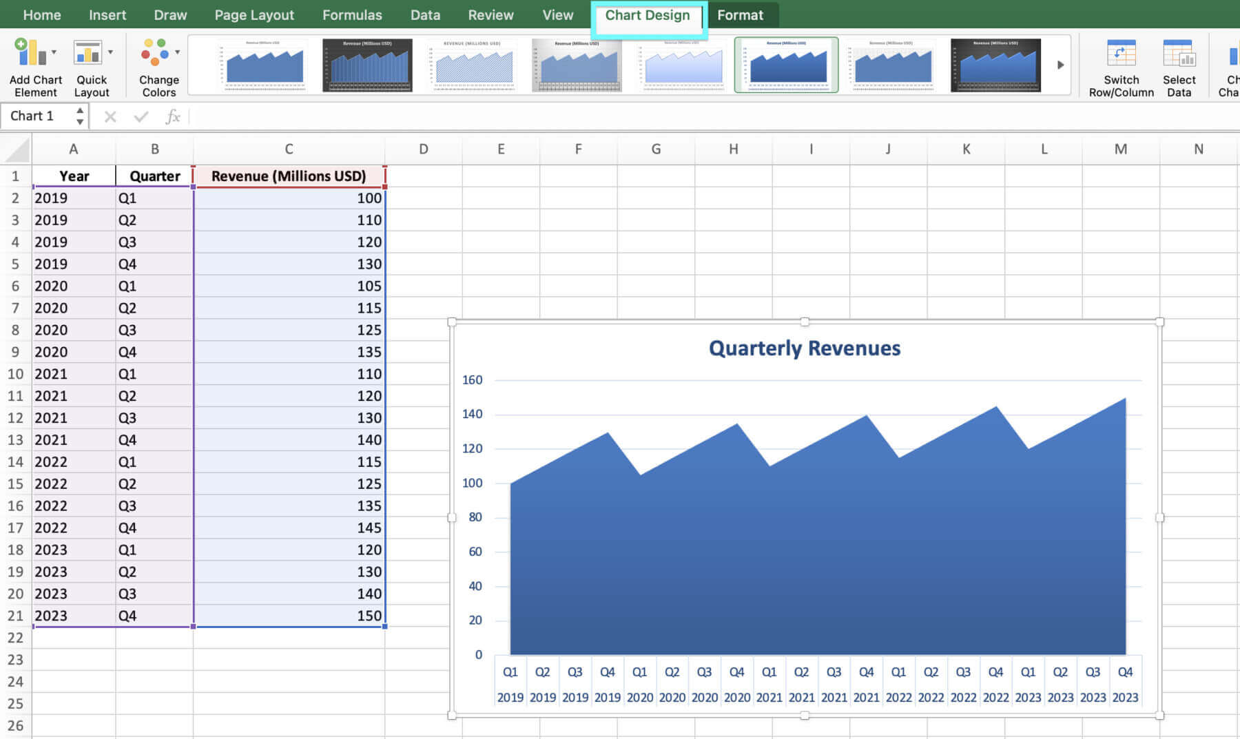
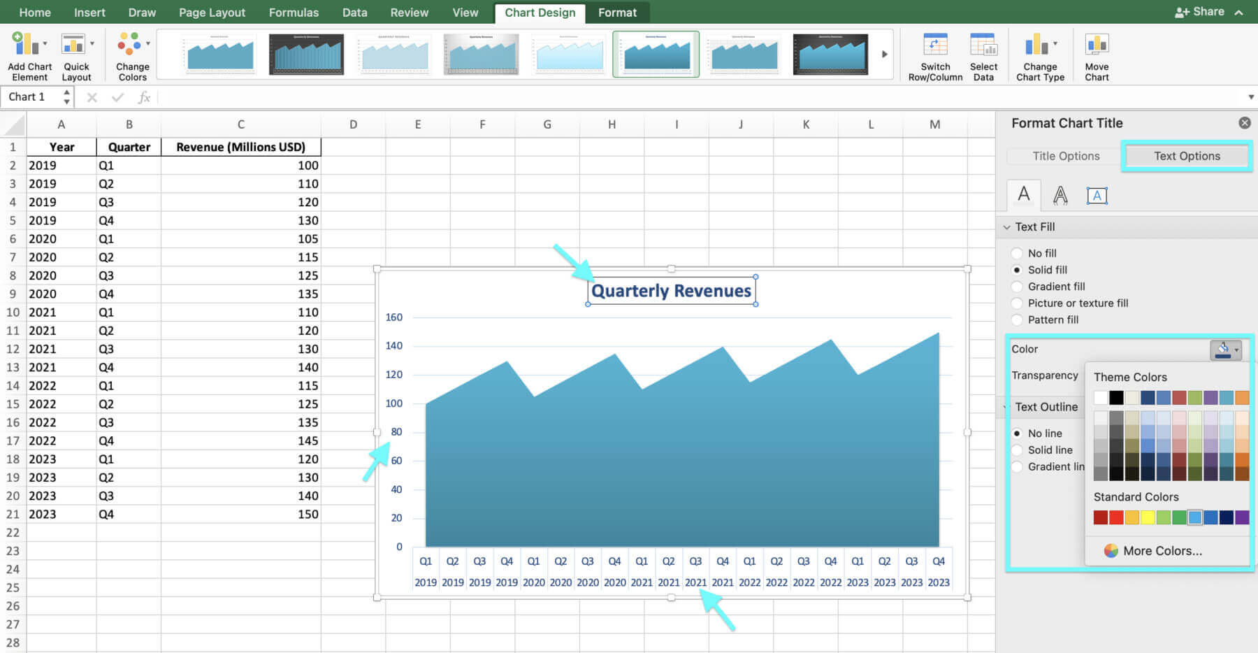
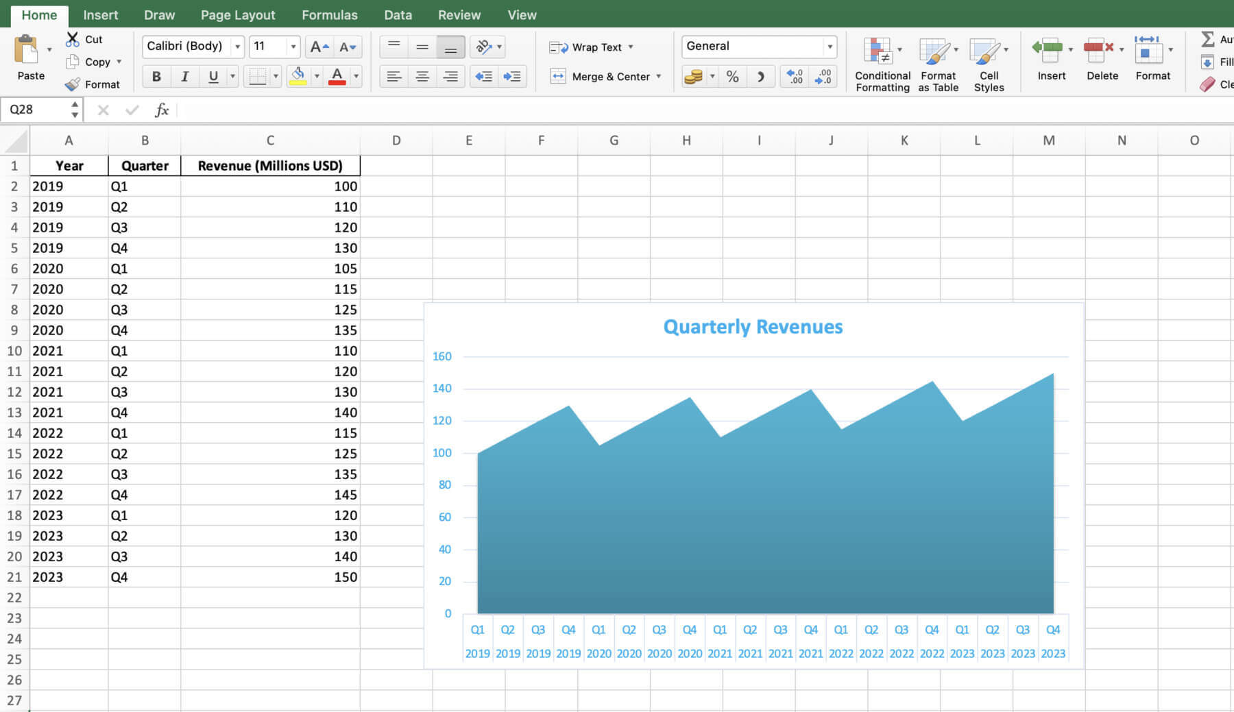
Imagine your role is an investment analyst. Your job is to look at a company’s revenue results over time. The company gave you quarterly revenue data from the past five years. By making an area chart in Excel, you can quickly see some important things such as below:

- The company has been growing its revenue each year compared to the last, especially the most recent year (2023). Their money coming in has been increasing consistently.
- It seems the company’s revenue changes depending on the quarter. The fourth quarter (Oct to Dec) usually has the highest revenue numbers. The first quarter (Jan to Mar) typically shows the lowest revenue. So their money earned is not the same each quarter, with more in some times of the year than others.
- The company’s income growth rate has sped up in recent years. The steepness of the area chart is increasing more quickly in 2022 and 2023 compared to earlier years.
One could assume from this that the company has a strong financial position with positive growth opportunities going forward. Investors may also want to pay close attention to the company’s quarter four earnings reports. These reports often have a big impact on the total income growth for the year.
This is just one example of how an area chart can be used to analyze financial data and help with investment choices. You can explore many different financial measures using area charts. Following the tips in this post can help you make informed decisions about investments, budgets, and financial planning.
With all these insights and tools at your disposal, let’s wrap this up and get you ready to chart your way through the financial data jungle.
Using Quick Charts by Macabacus
With Quick Charts by Macabacus, you can automate and minimize the complexity of chart creation, reducing it to just a few mouse clicks. Quick Charts is a tool designed to simplify the complex and tedious process of creating charts commonly used in finance and consulting, compared to the native Excel functionality.
When creating a new Quick Chart, a preferences dialog lets you customize orientation, formatting, labeling, and sizing. Macabacus remembers your preferences for future use, streamlining your workflow even further. Additionally, most Quick Charts come with in-worksheet options, enabling you to tweak the chart’s appearance later, even if Macabacus isn’t installed.
Conclusion
Now, you’re set to make area charts that tell your financial story and guide strategy. Remember, it’s all about knowing your data, picking the best chart, and sticking to data prep, design, and understanding best practices.
Getting good at making area charts in Excel and following these tips helps finance pros up their data visualization game and make smarter choices on investments, budgeting, and financial planning. Don’t hesitate to experiment to discover what best suits your needs. If you want to take your charts to the next level, try Macabacus.
By sharpening your data visualization skills and applying what you’ve learned here, you’ll be ready to make area charts that not just inform but also motivate action. Whether you’re a seasoned investment banker or a newbie financial analyst, we encourage using area charts to get deeper into your financial data and get better business results.
Happy charting!


